Universe · 2024
Universe's Website Editor
Led the end-to-end design process to build an entirely new website editor for Universe — an Apple Design award winning iOS app and web app.
Role
Lead Product Designer
Skills
- User Experience
- Information Architecture
- Motion Design
- Prototyping
- User Testing
Team
- 1 Product Manager
- 1 CEO
- 3 Web Engineers
- 4 iOS Engineers
- 1 iOS Product Designer
- 2 Brand/Template Designers
Company
People could only build a desktop site that looked like a giant version of their mobile site.
This dissatisfaction with the responsiveness of the site led to many leaving Universe for other more flexible website builders.
- Goal
- Redesign the website editor so it allows for both desktop and mobile layouts while being editable on any device.
- Limitations
- Some blocks won’t support undo/redo because they have their own save states or connect with external APIs. Won’t work in iOS app.
- Success Metrics
- Neutral or improvement to main business metrics such as new users, trial-to-sub, and retention.
Creating a new editor architecture
Exploring other editor approaches
I looked at how competitors approached desktop and mobile website builders.
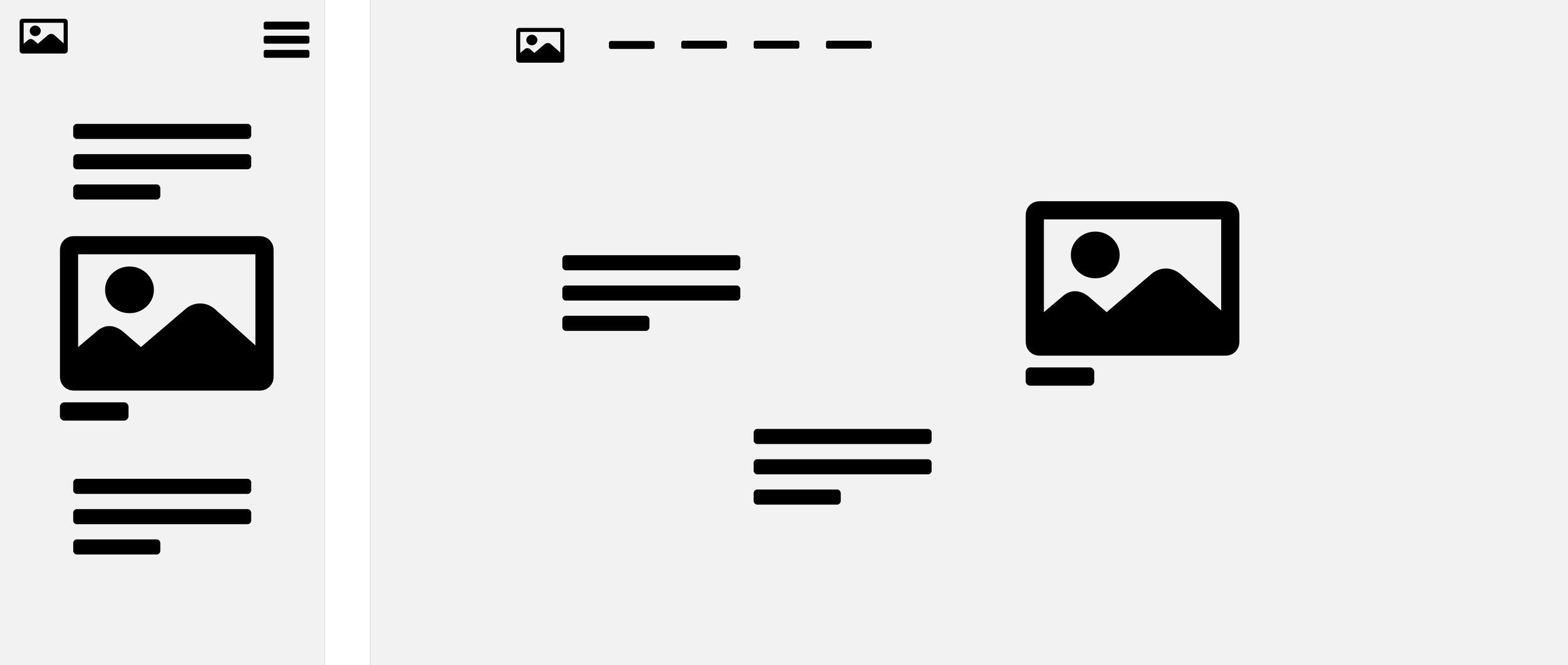
Grid concept explorations
What if the grid adjusted to the content and the browser?
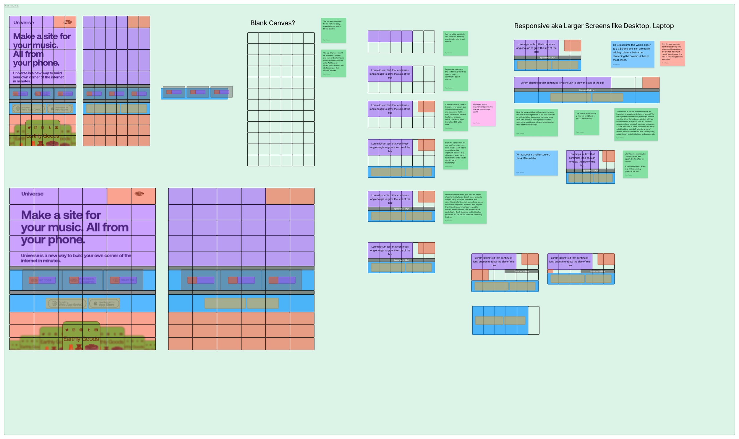
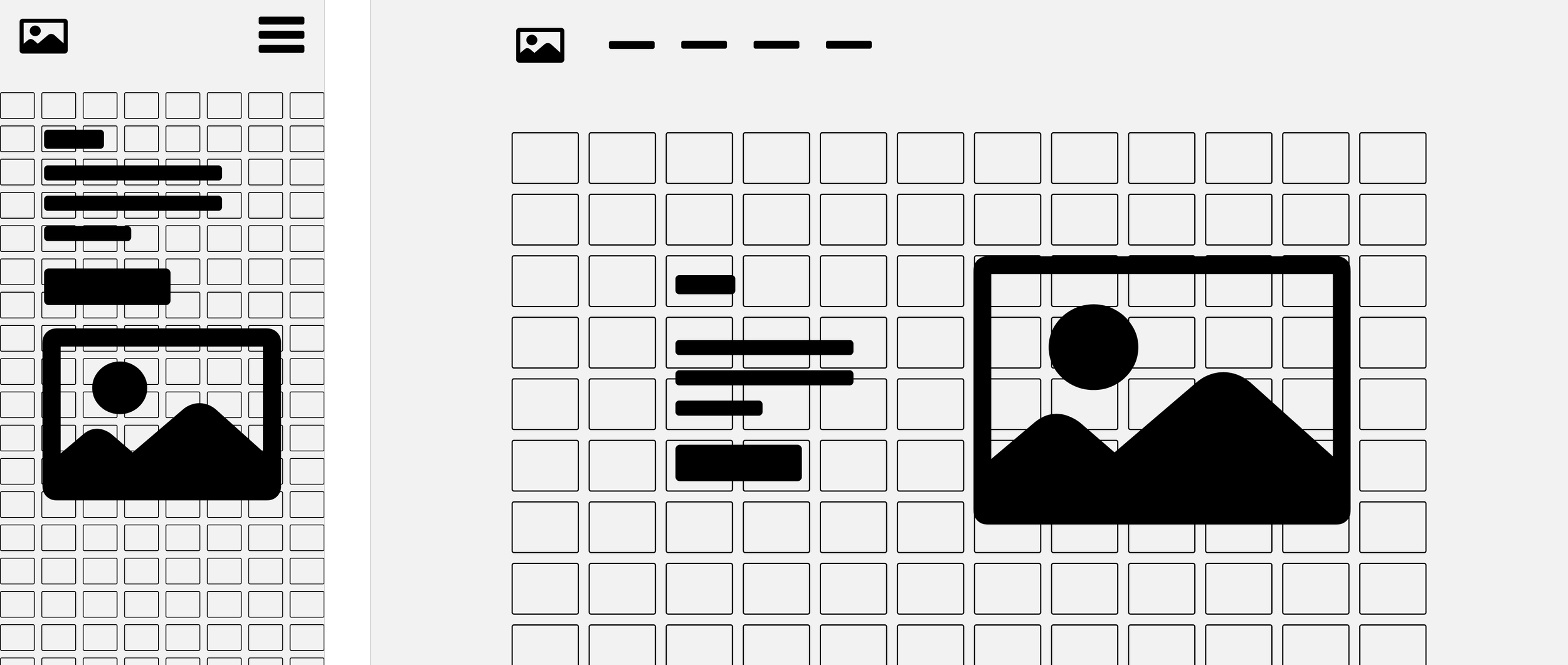
Final Approach: Flex Grid
After many design reviews, we arrived at a grid editor shared by mobile and desktop where content is able to scale to fit the browser size.

How does the Flex Grid work?
The grid fits to the content instead of the content having to fit into a rigid grid, like the previous editor.
Rows resize to fit content
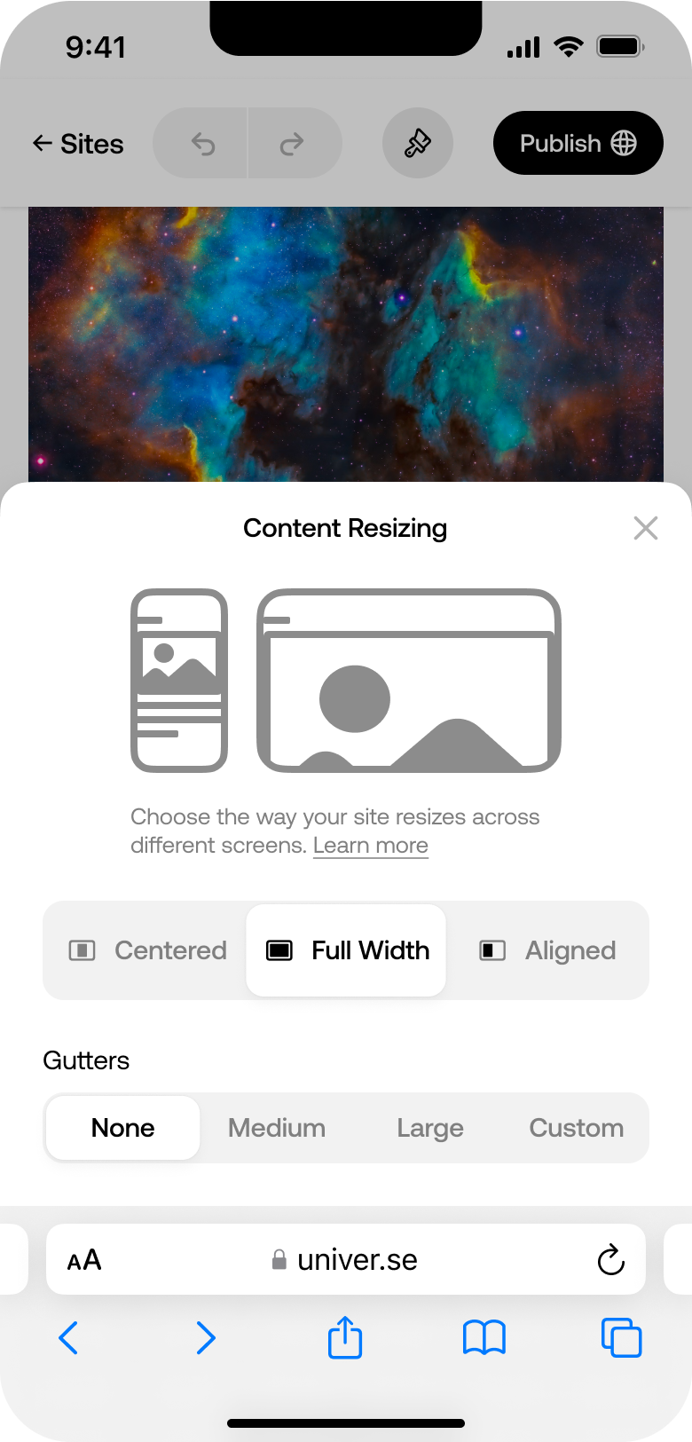
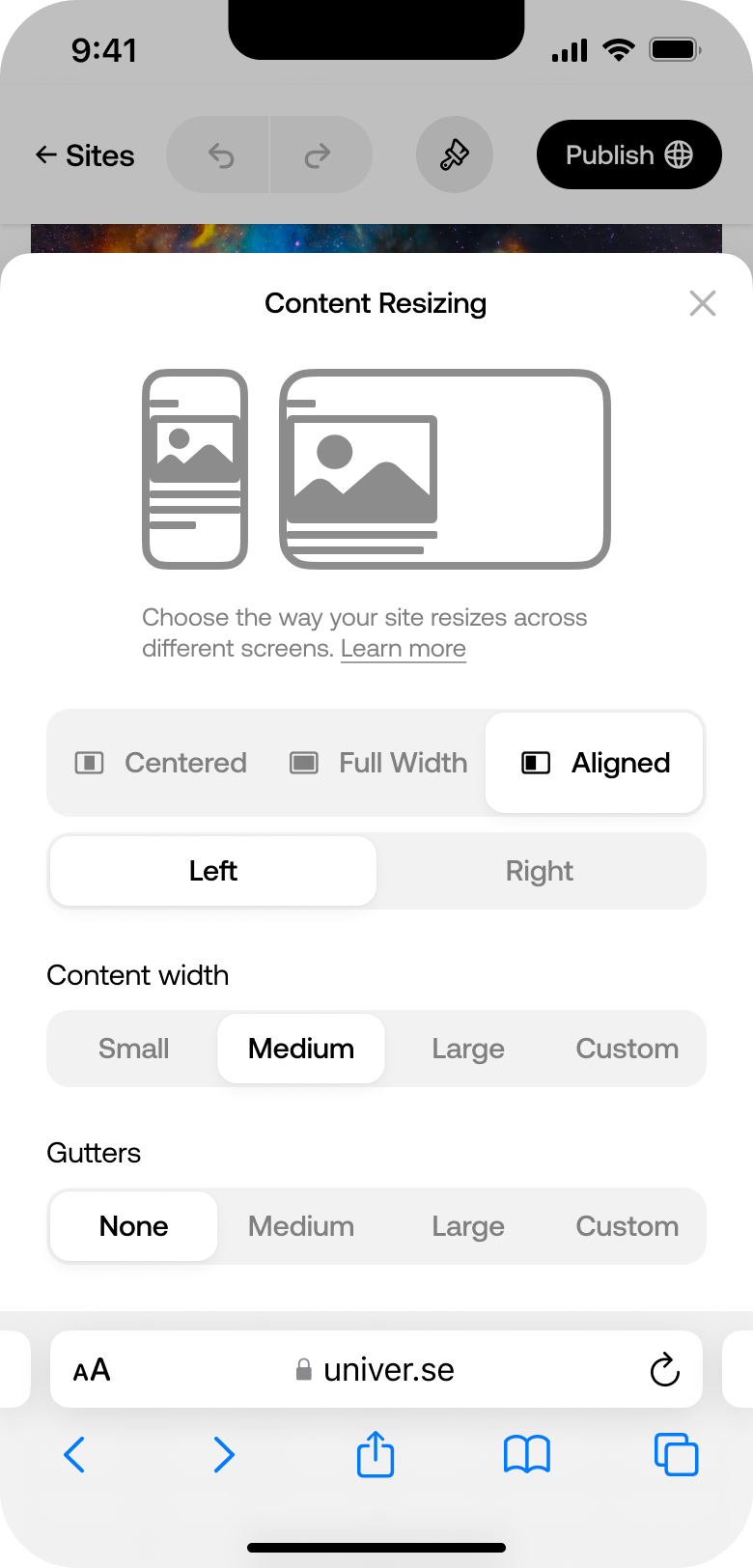
Gutter space outside the grid
Page content sizing
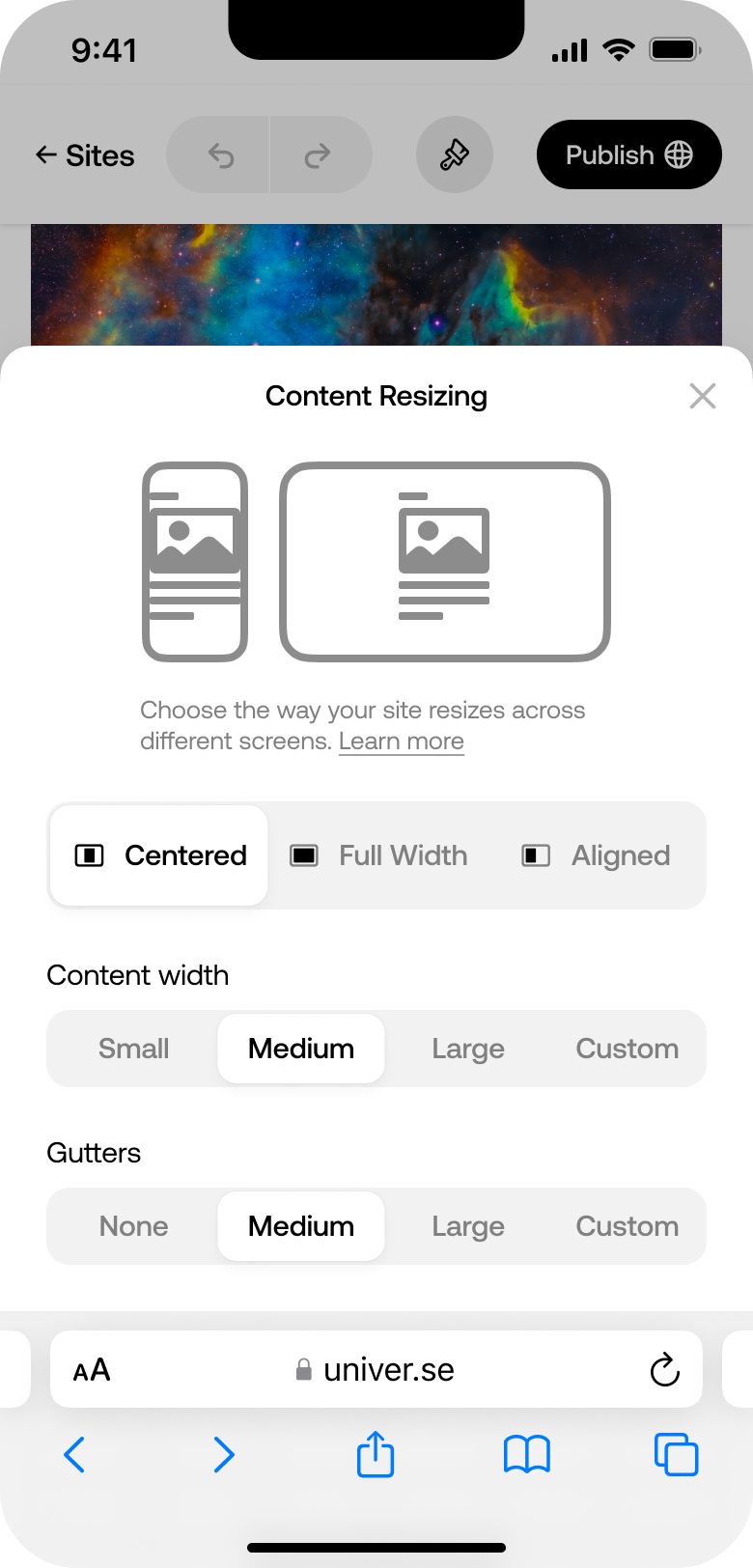
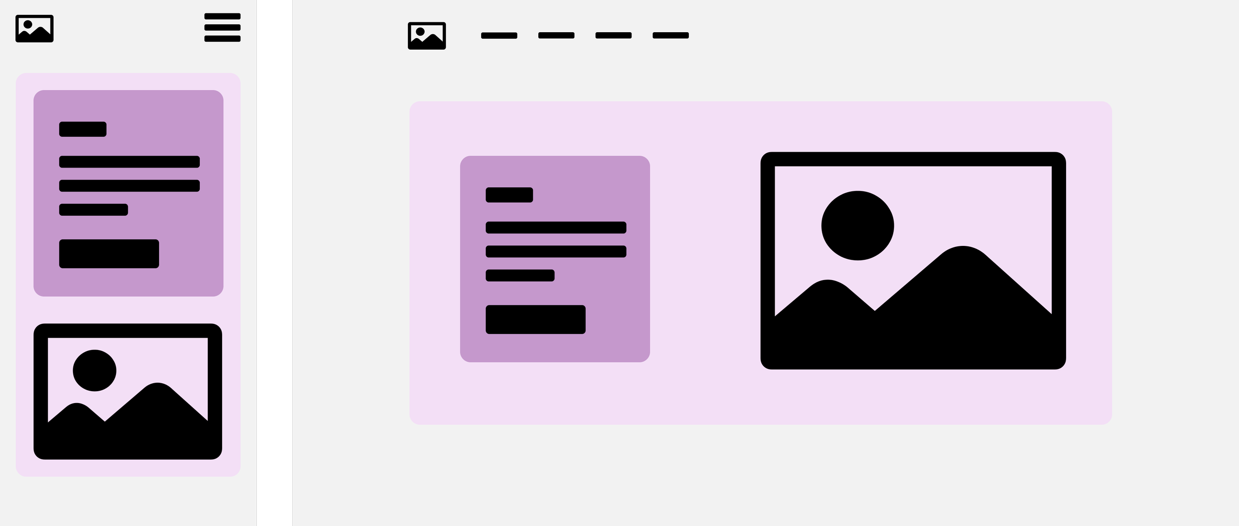
How do blocks work in this new system?
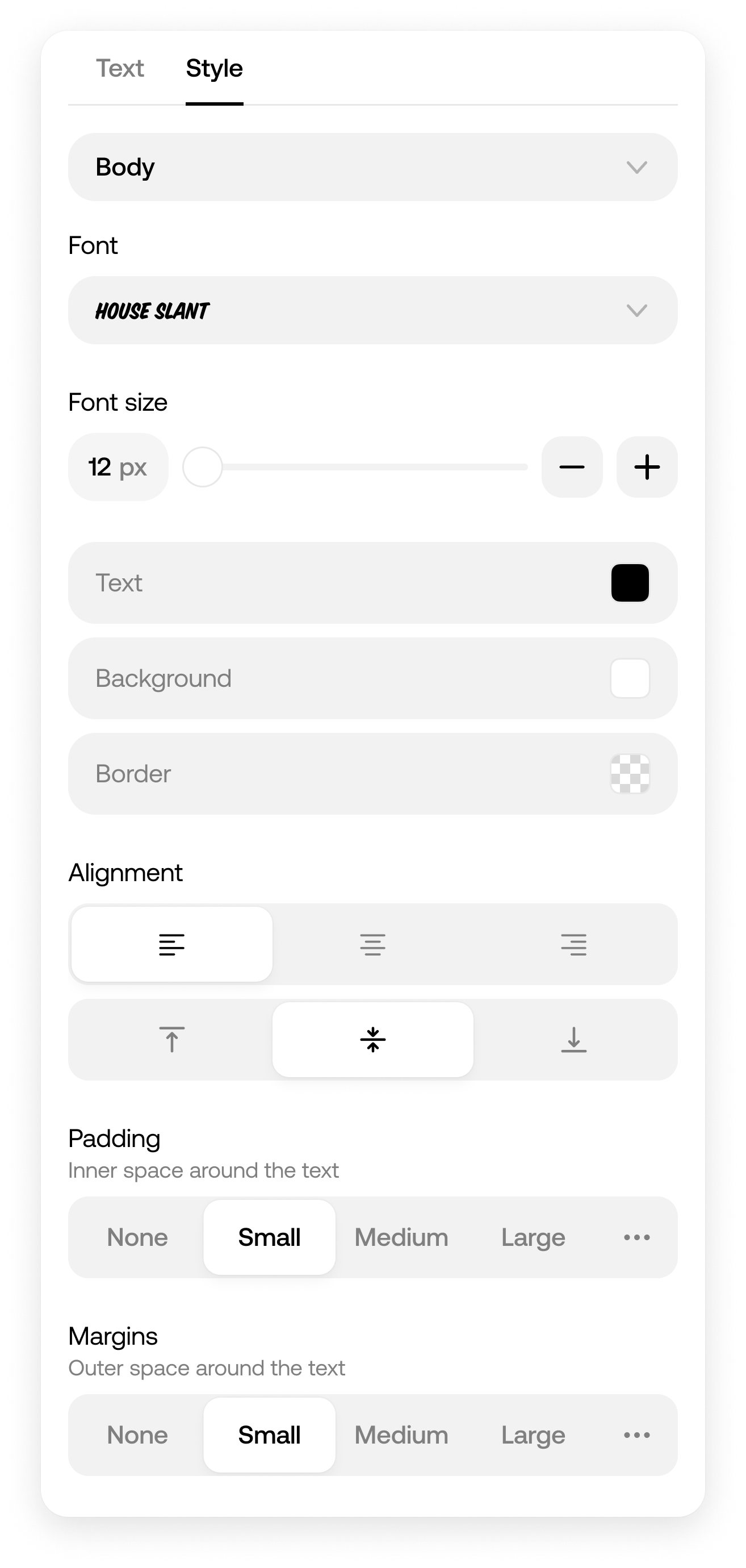
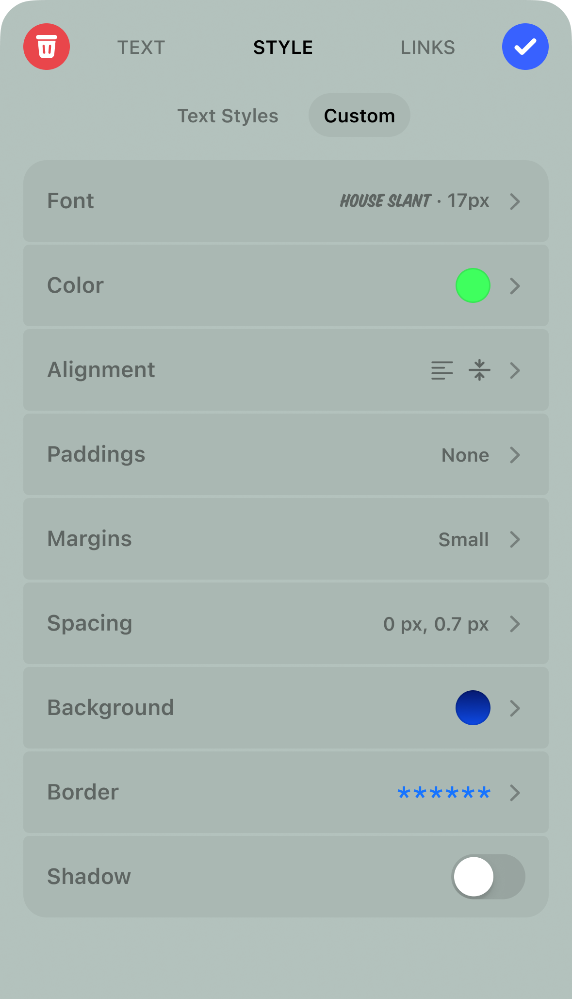
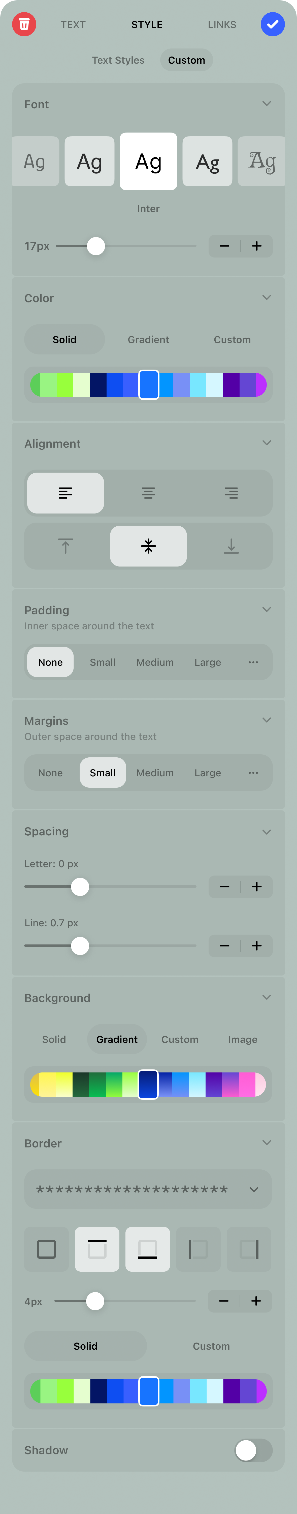
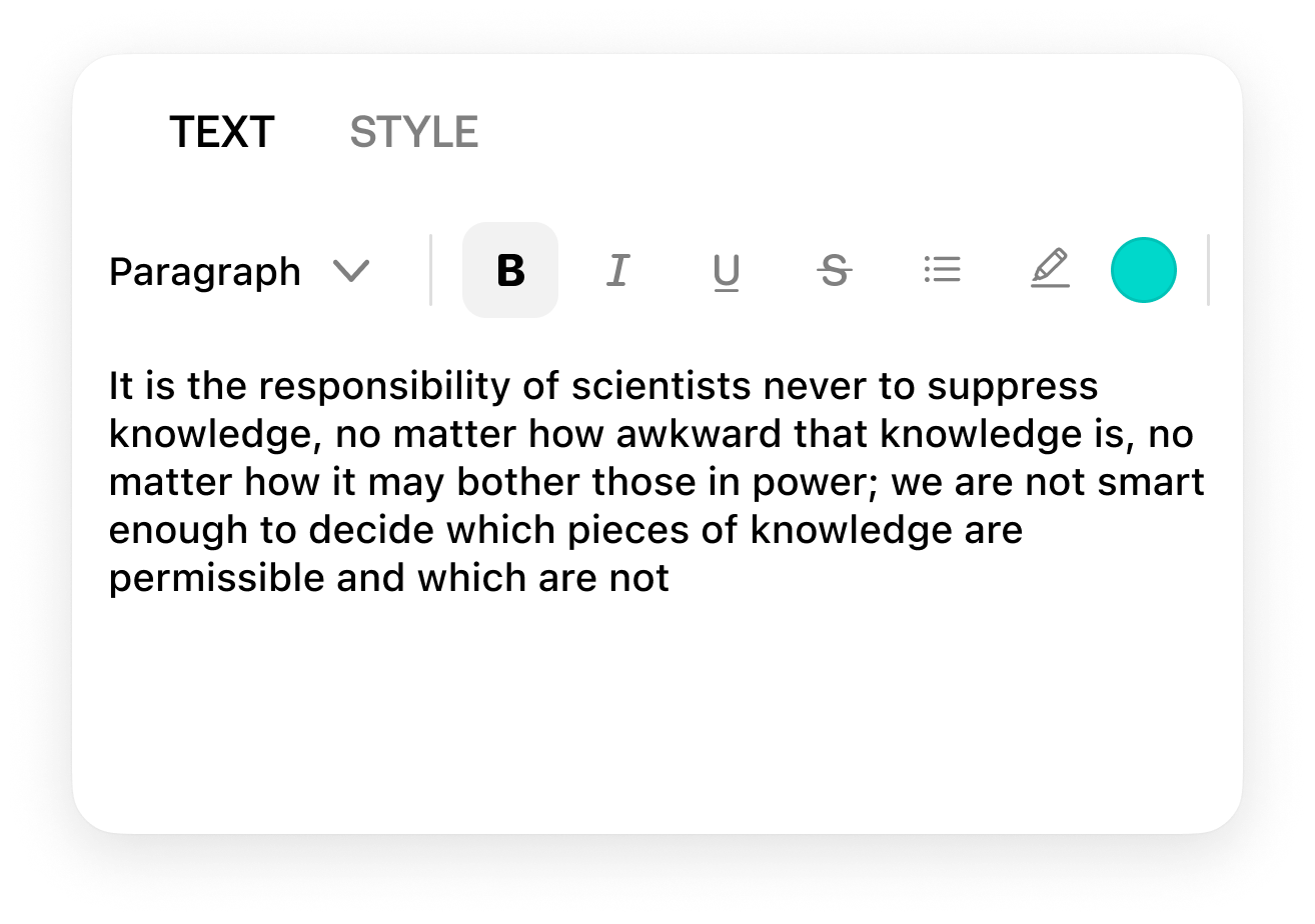
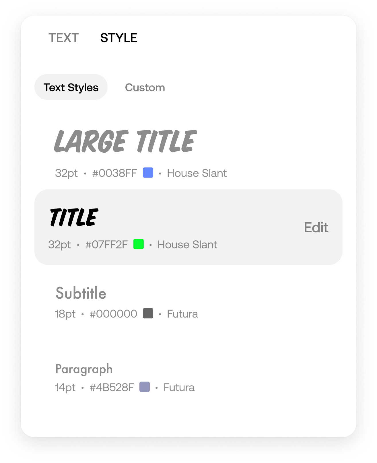
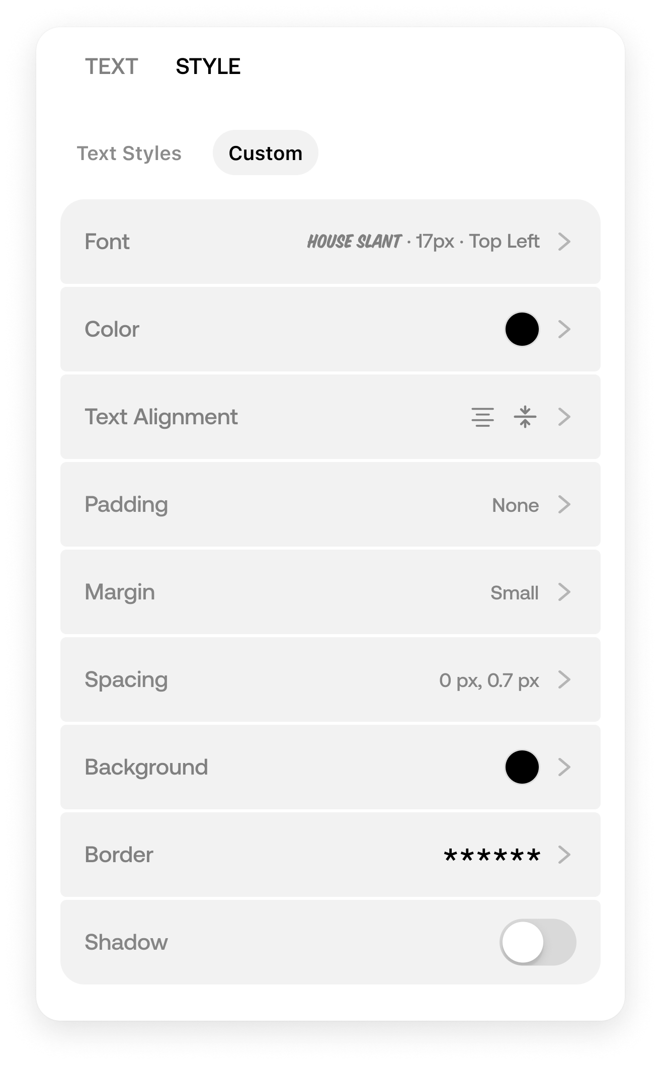
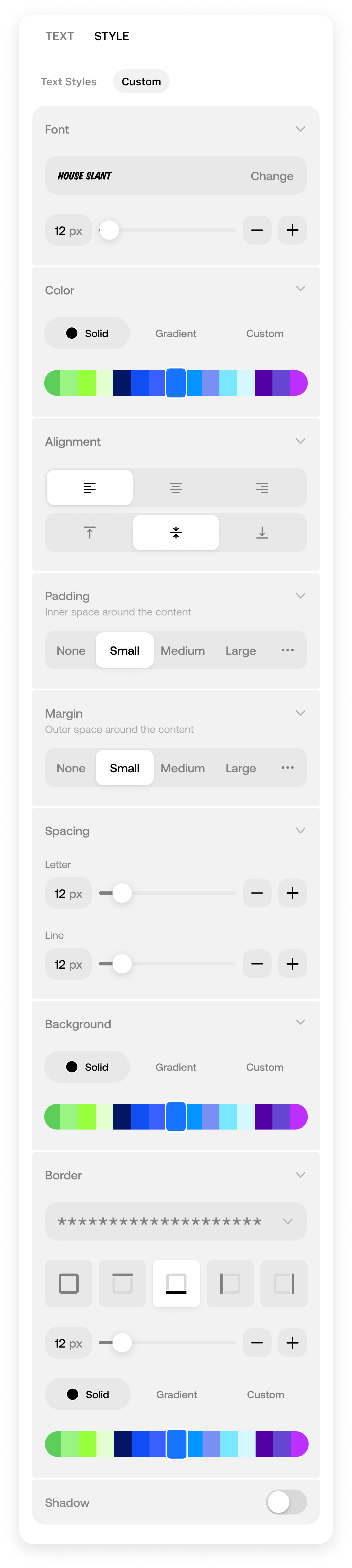
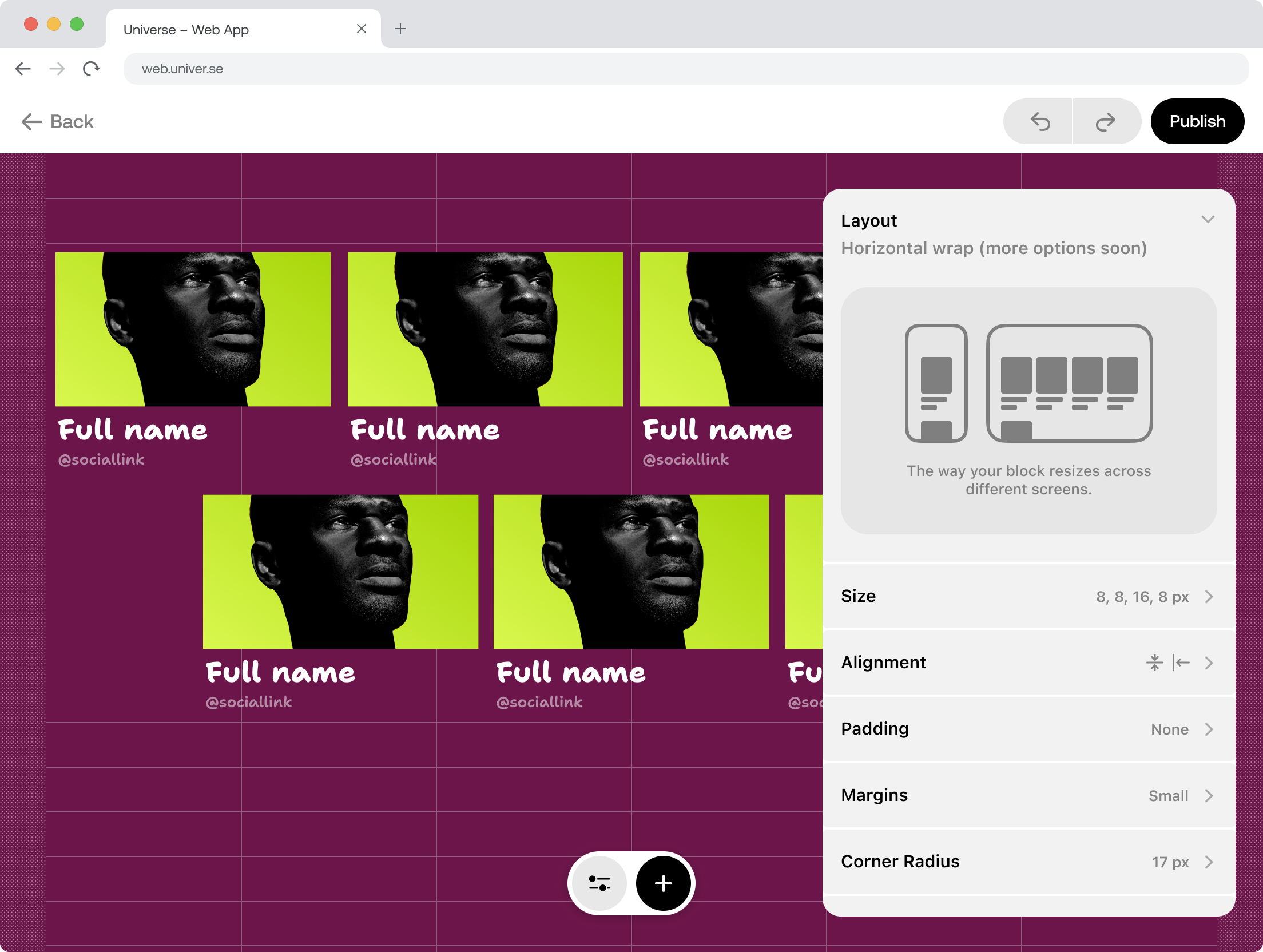
Block Settings
Creating some new settings required creating new components, like segmented control, and design them to be useable across many different contexts.
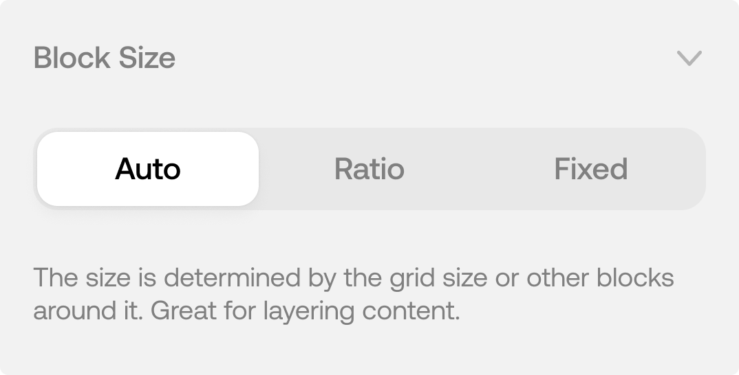
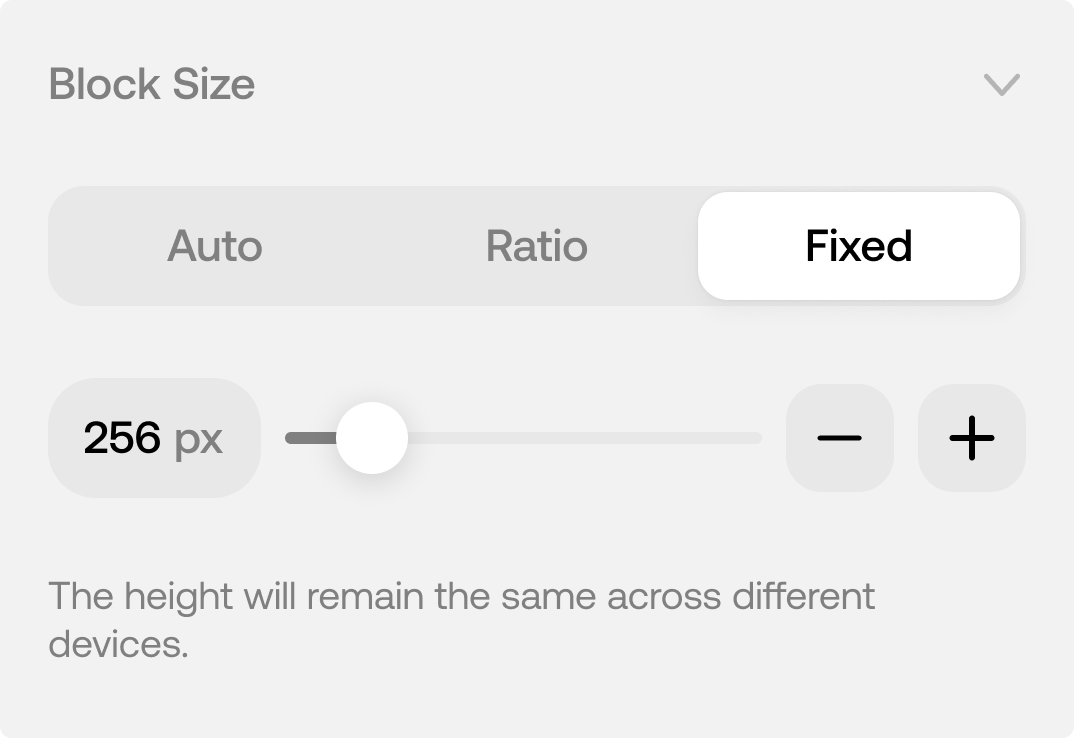
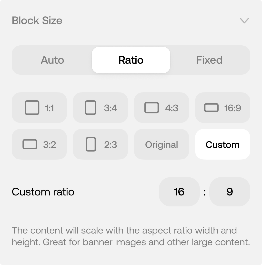
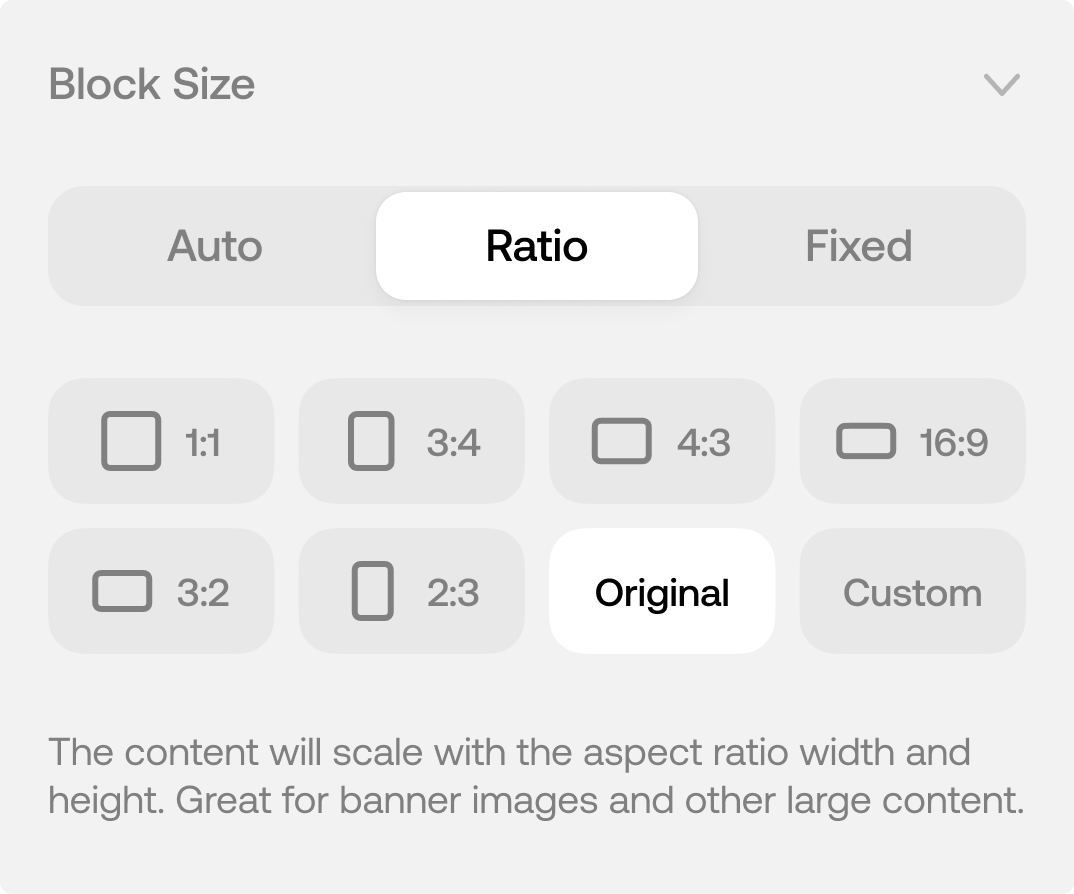
Block Size
Set the content size based on aspect ratios or a fixed pixel height.
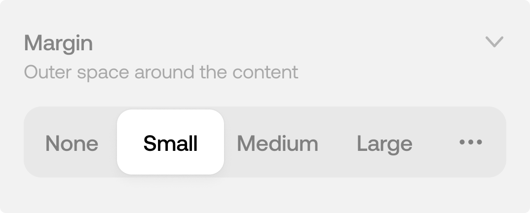
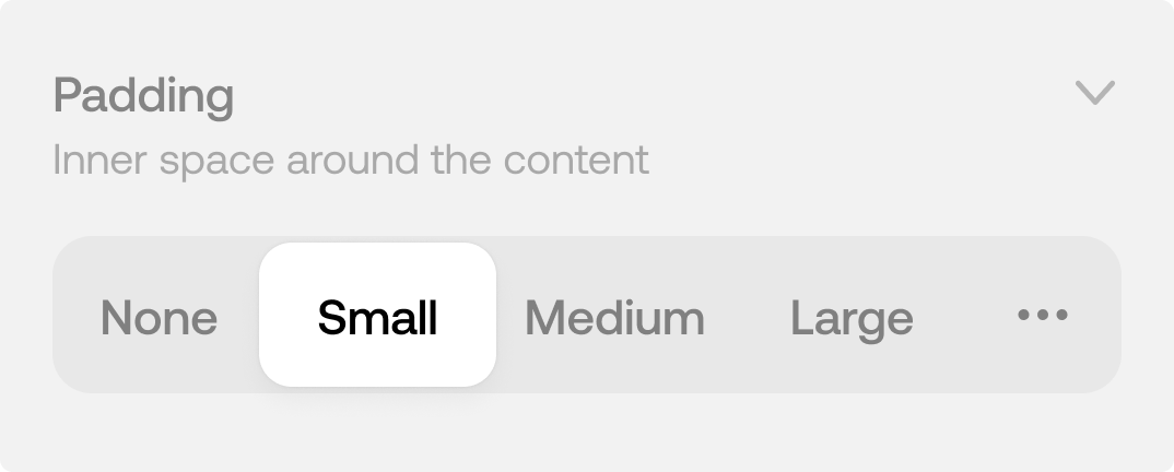
Spacing
Padding and margin to add optional space around the content.
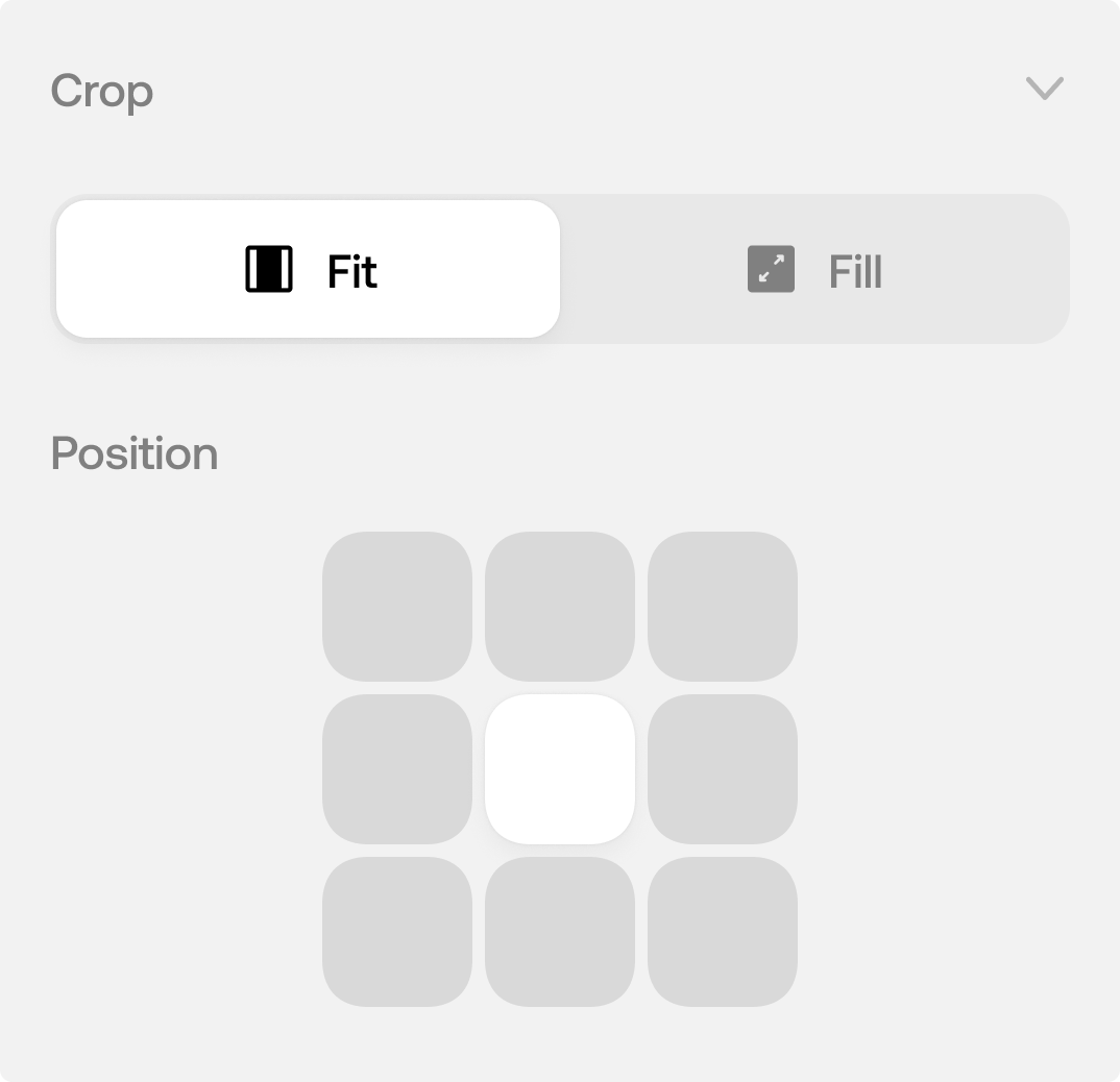
Crop (Image/Video)
How the content should fill the container.
Positioning
Where to anchor the content within the block container.
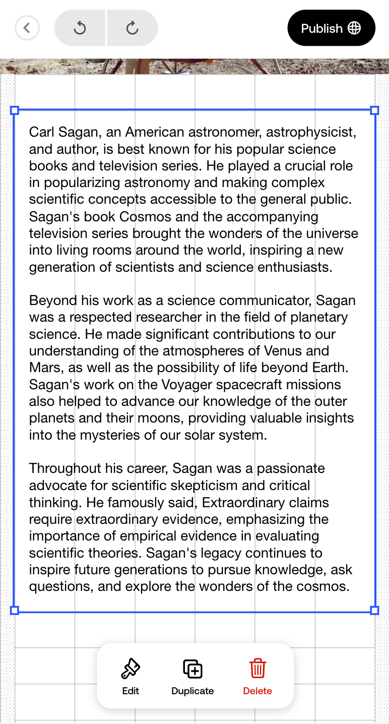
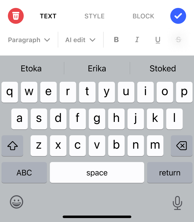
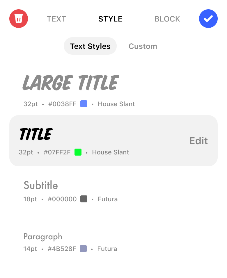
Accordion Block Editors for iOS and Web
For the first time, we created a consistent design language for the blocks across iOS and Web App.
iOS designed by and in collaboration with fellow designer Alex Burdin.
iOS
Web
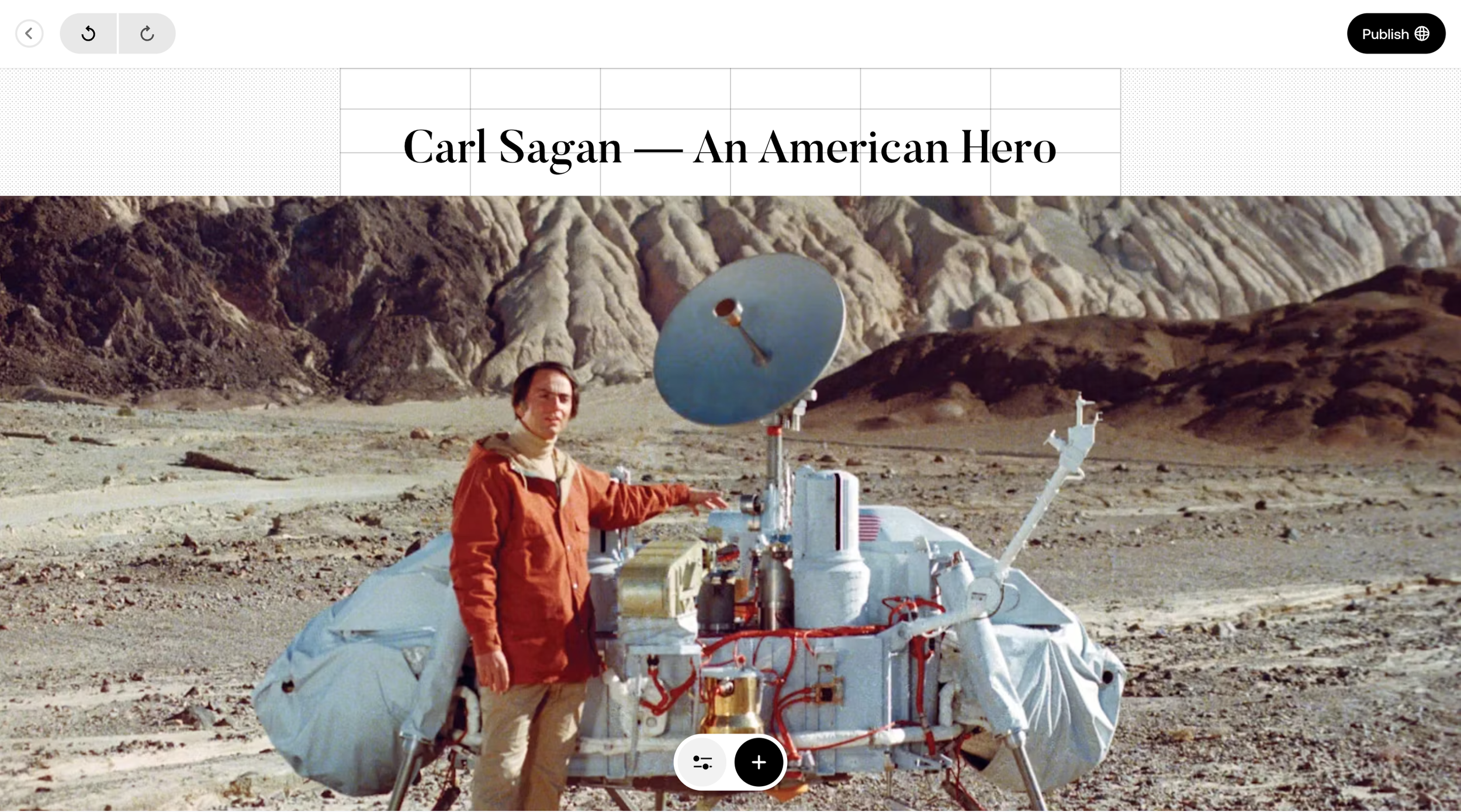
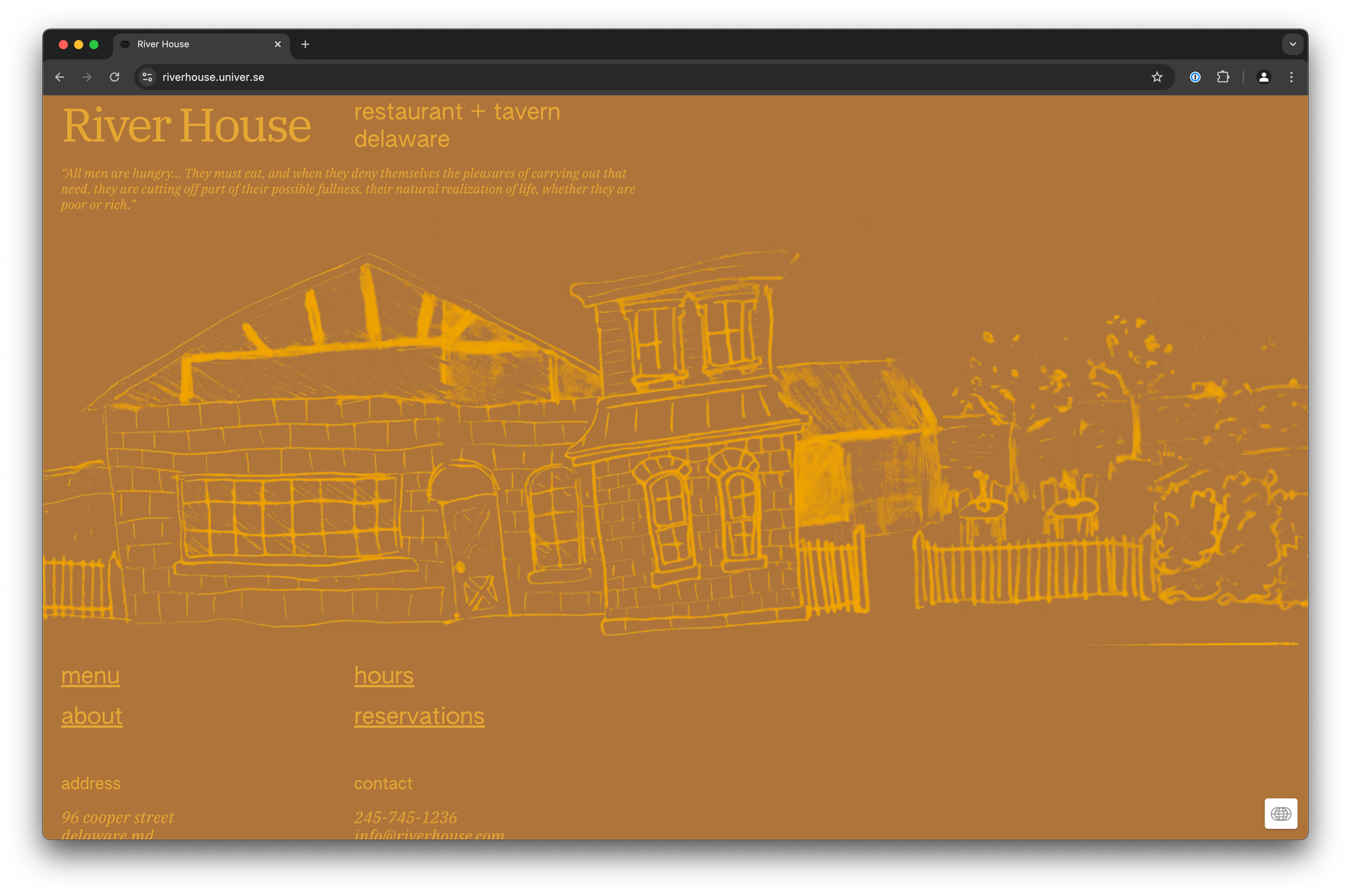
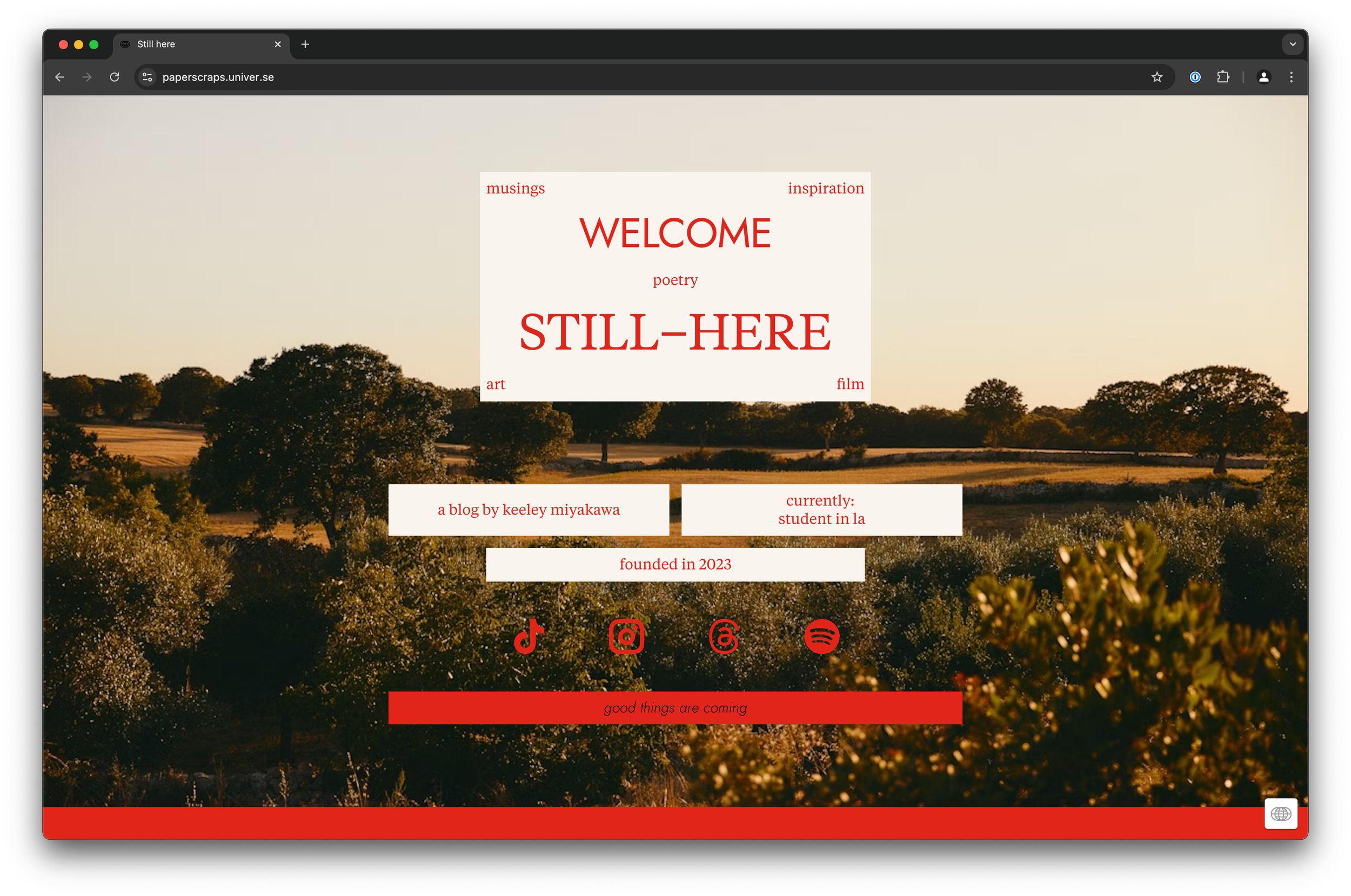
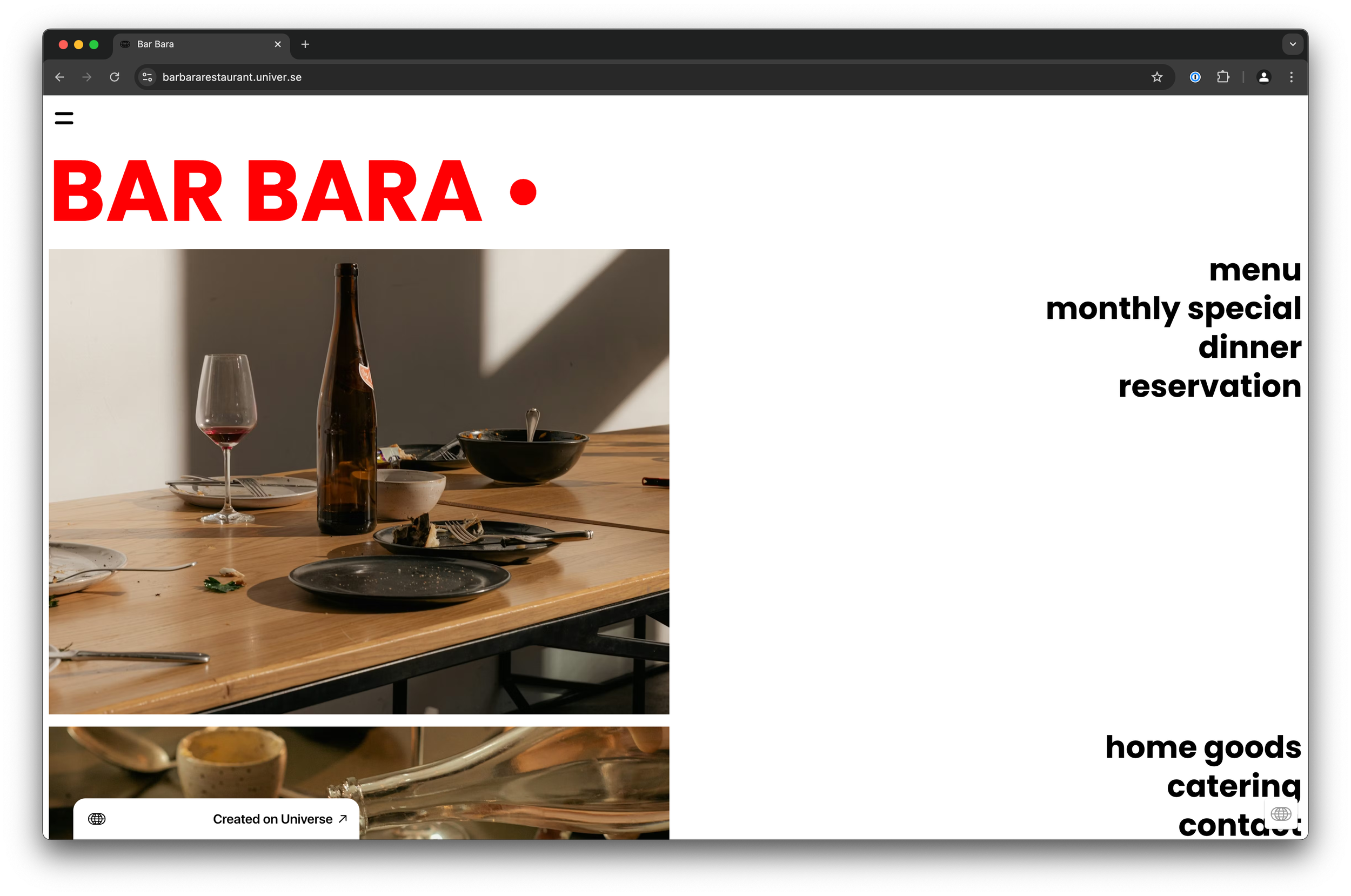
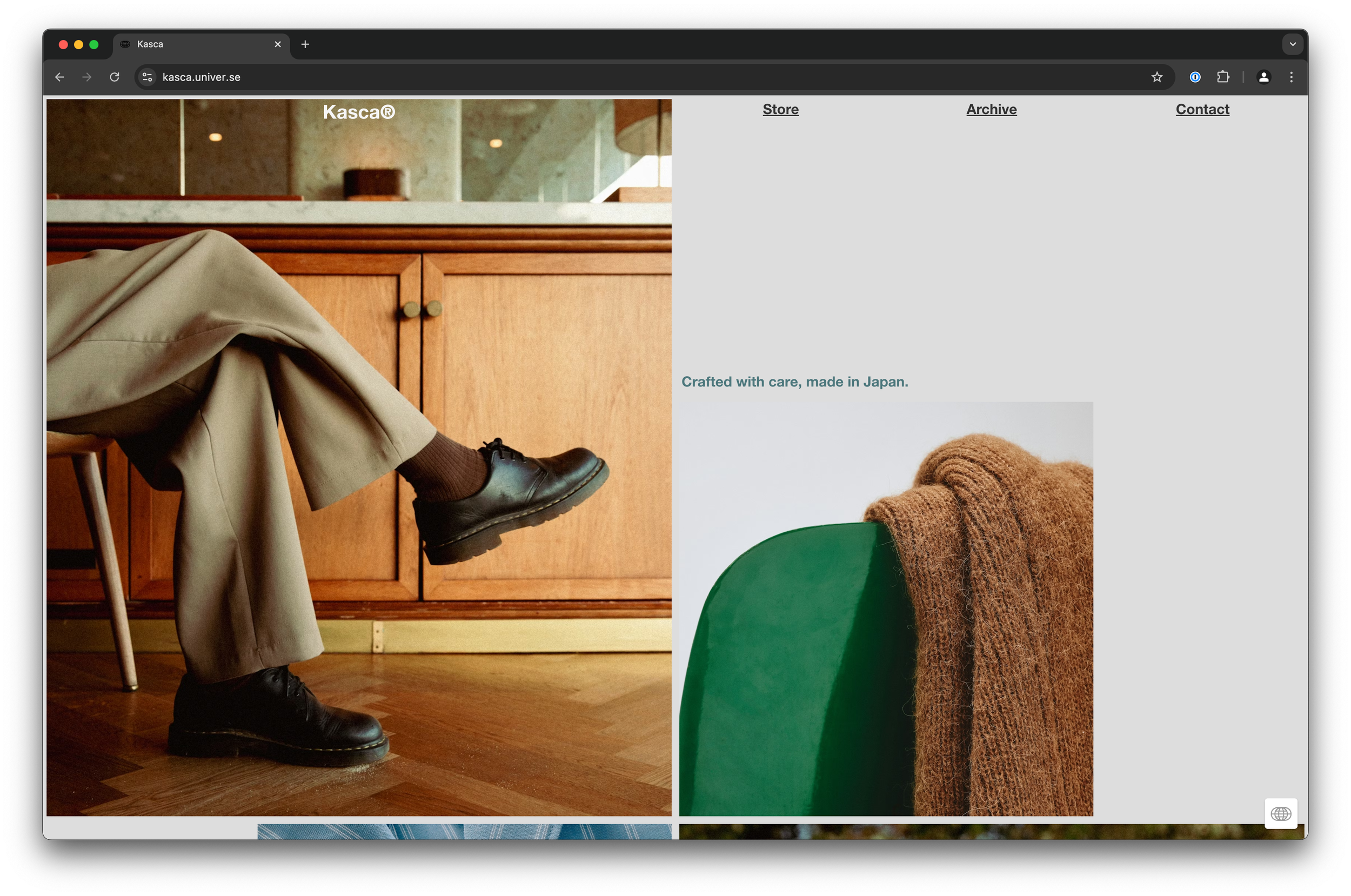
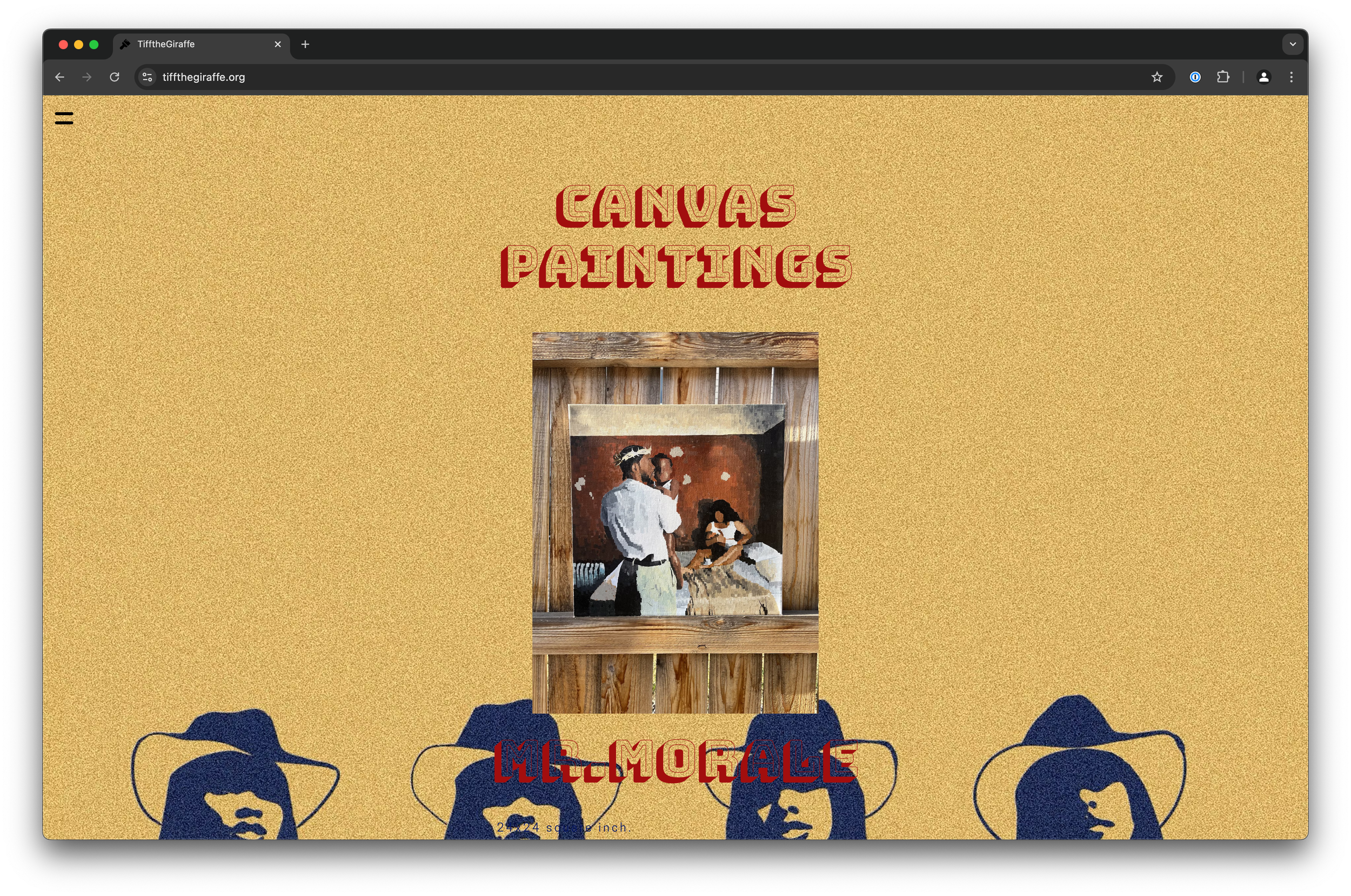
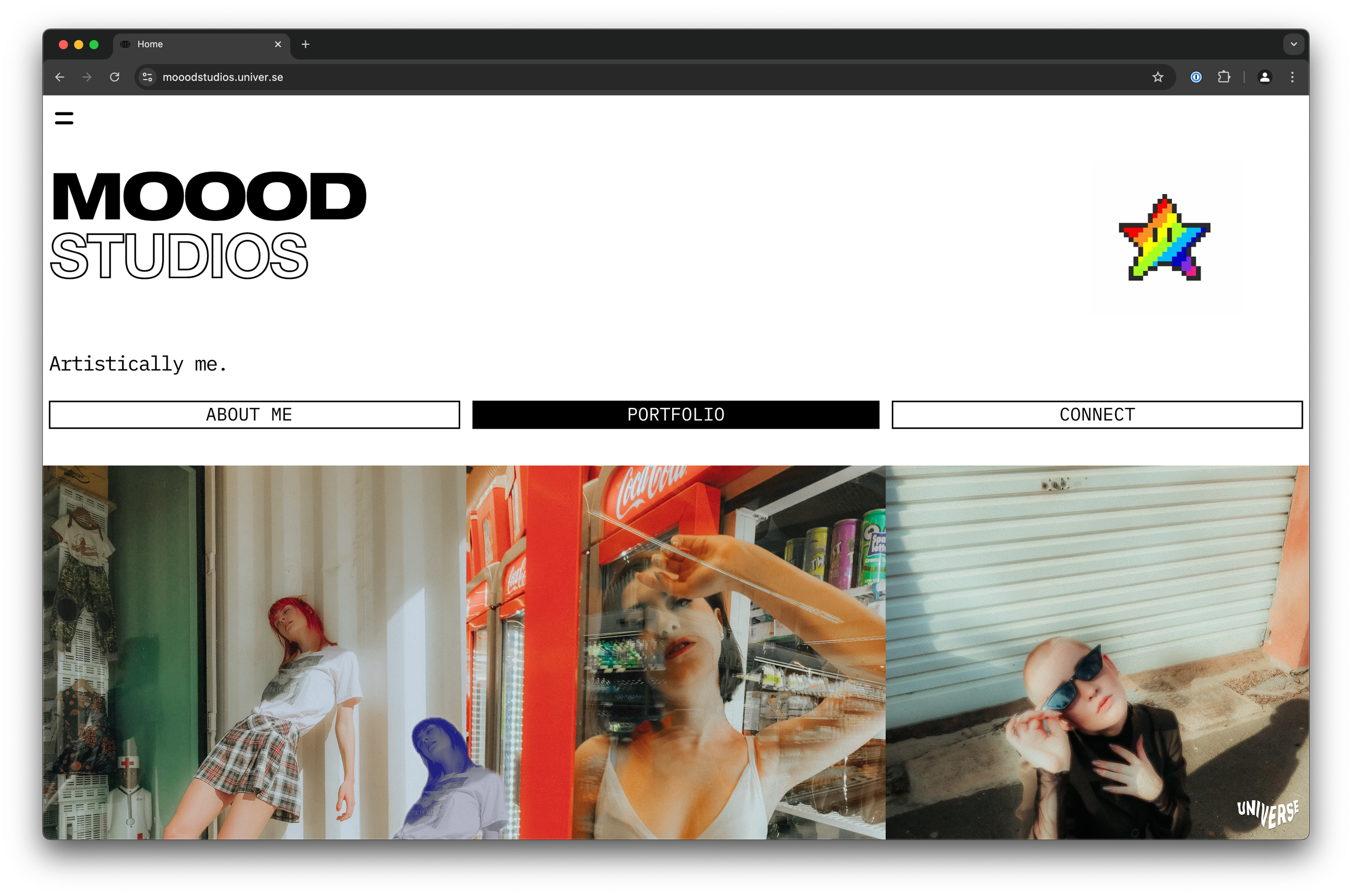
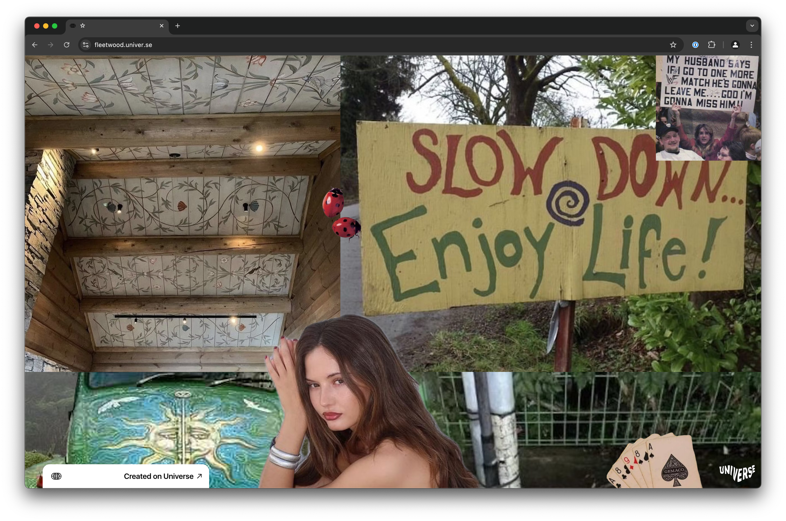
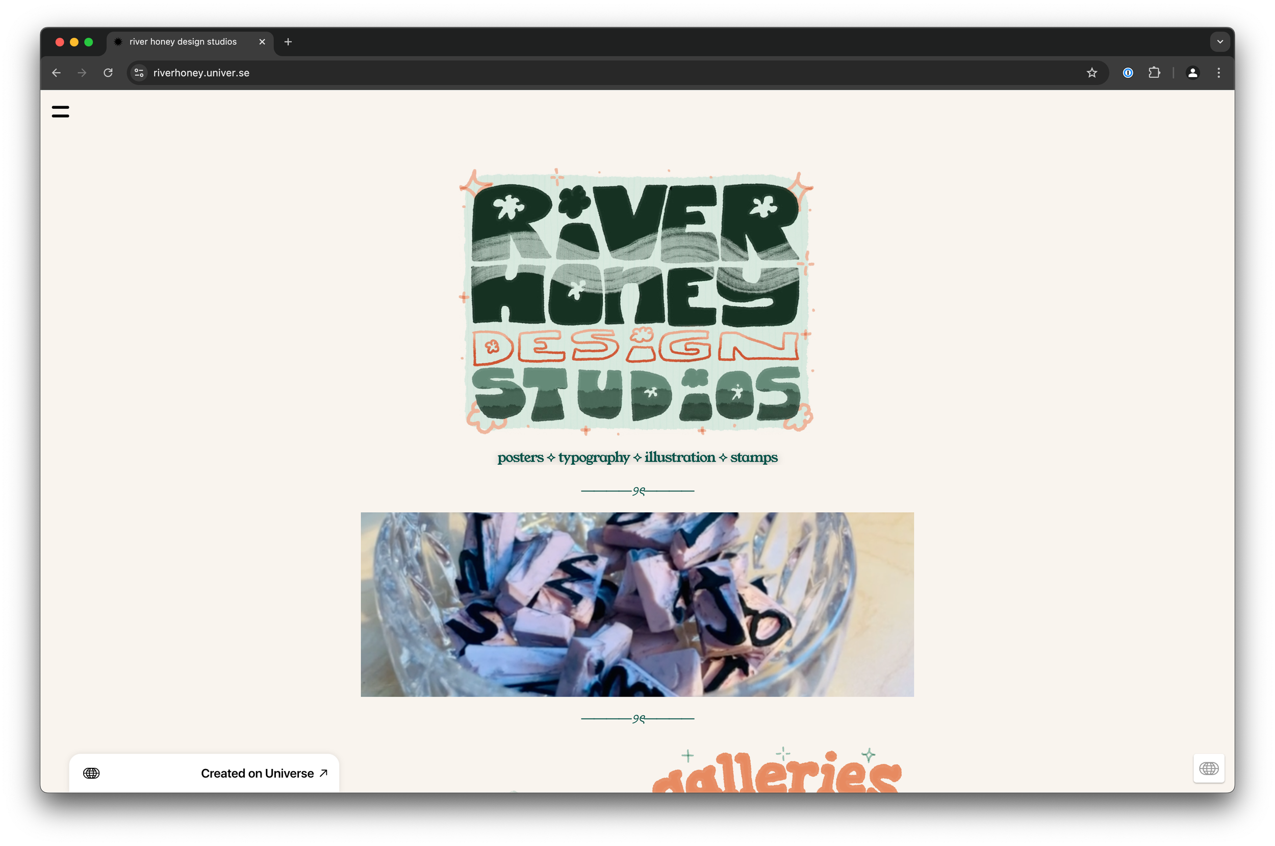
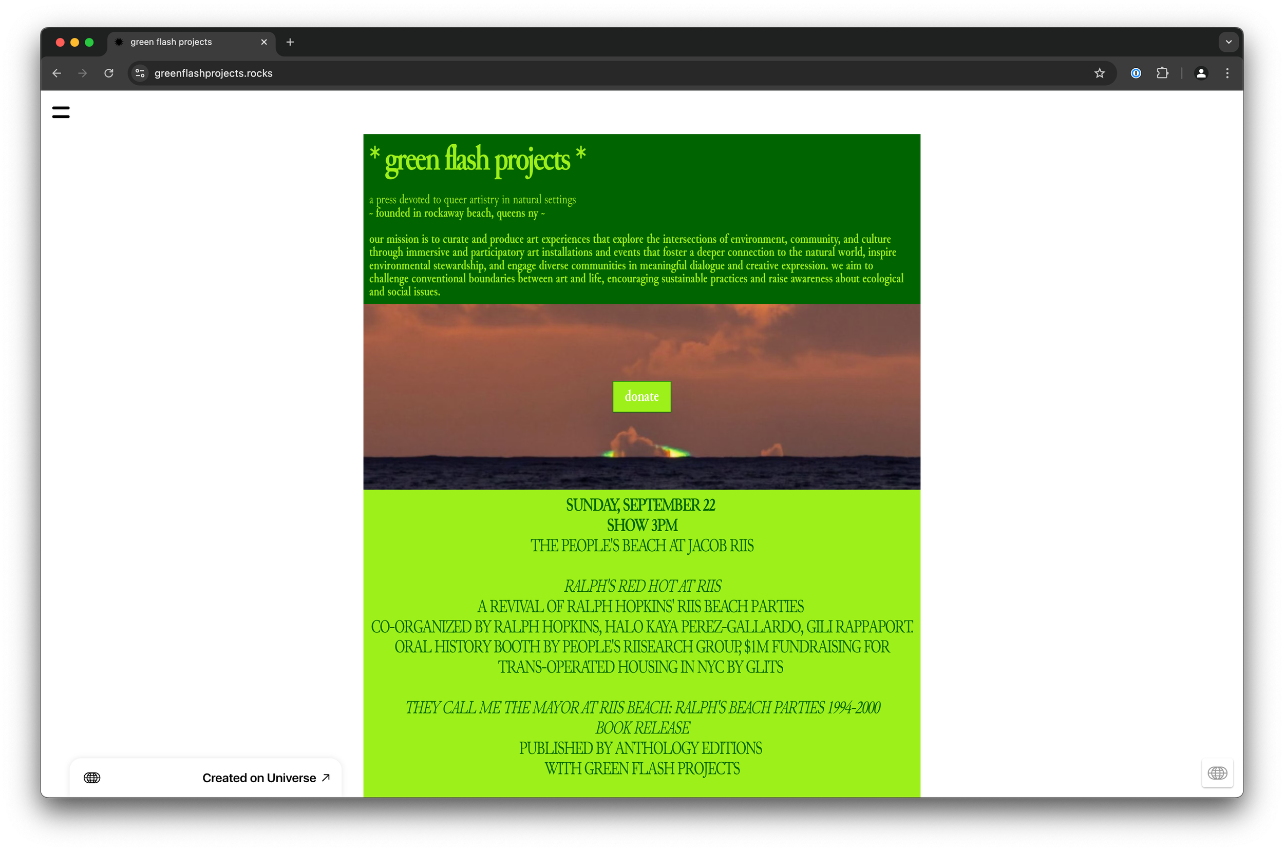
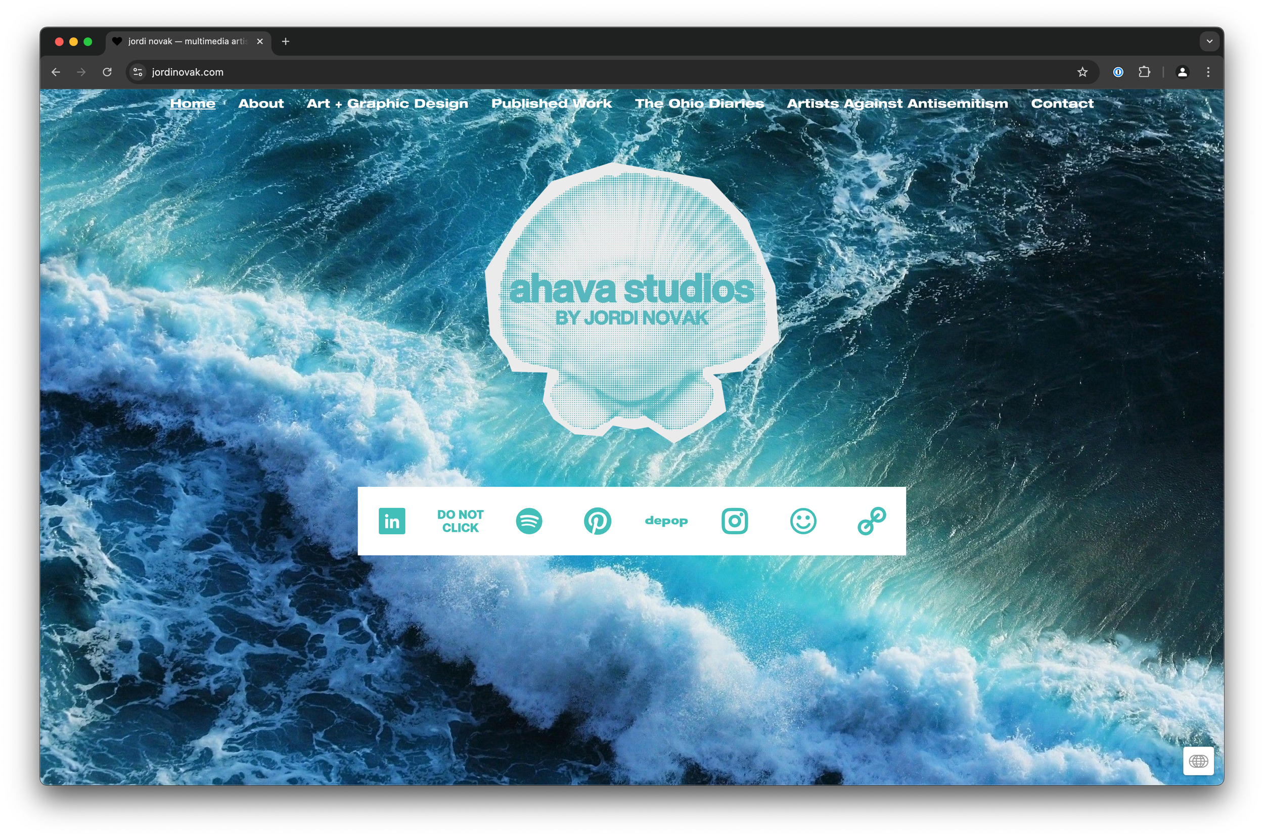
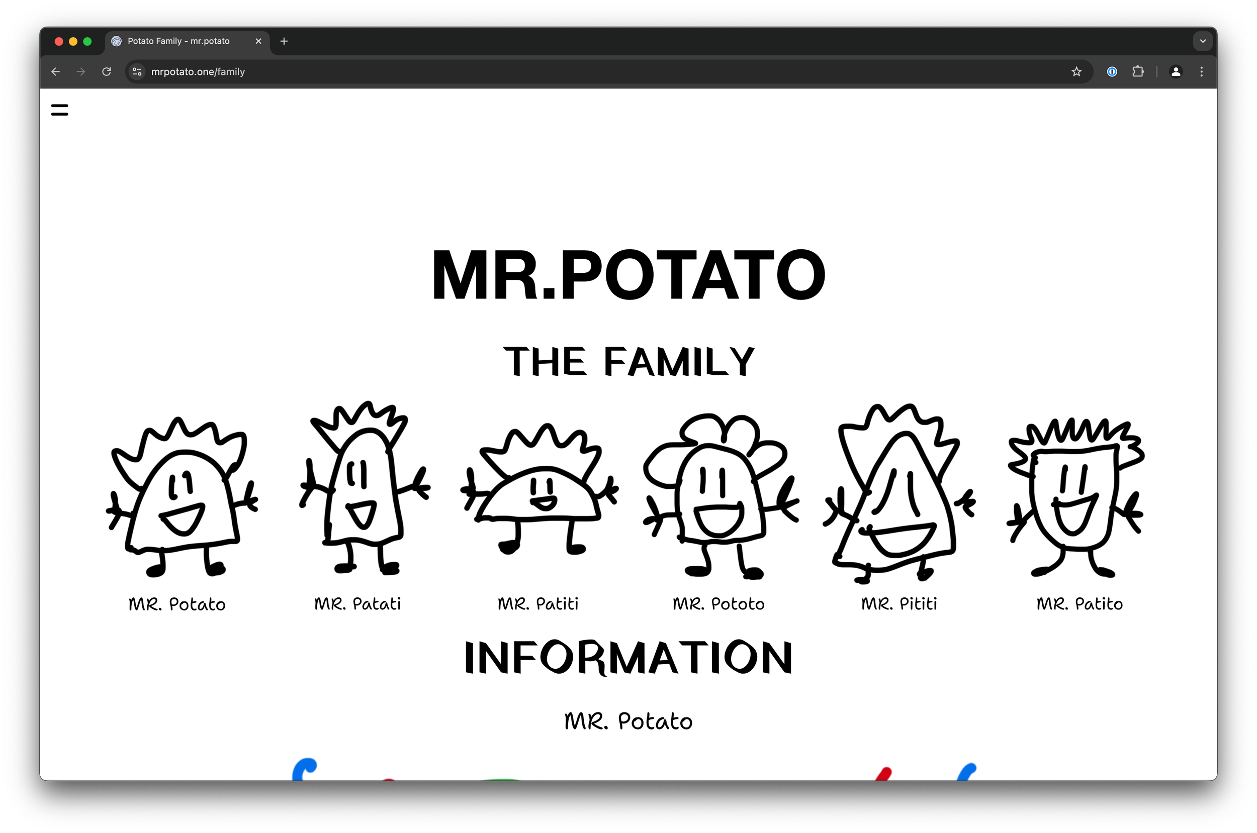
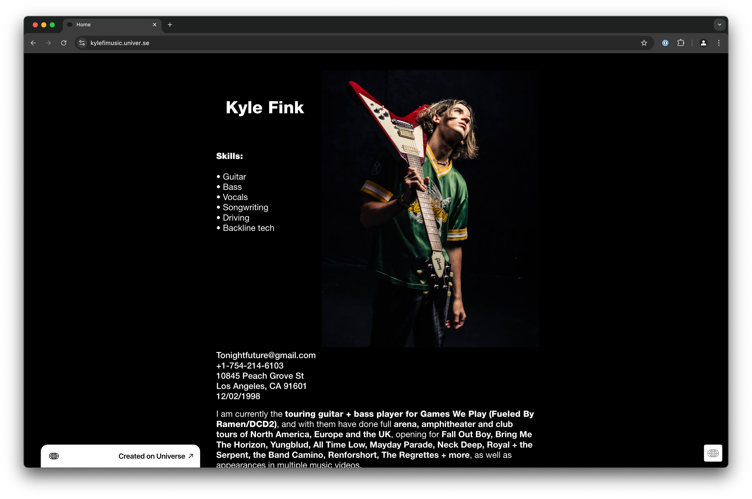
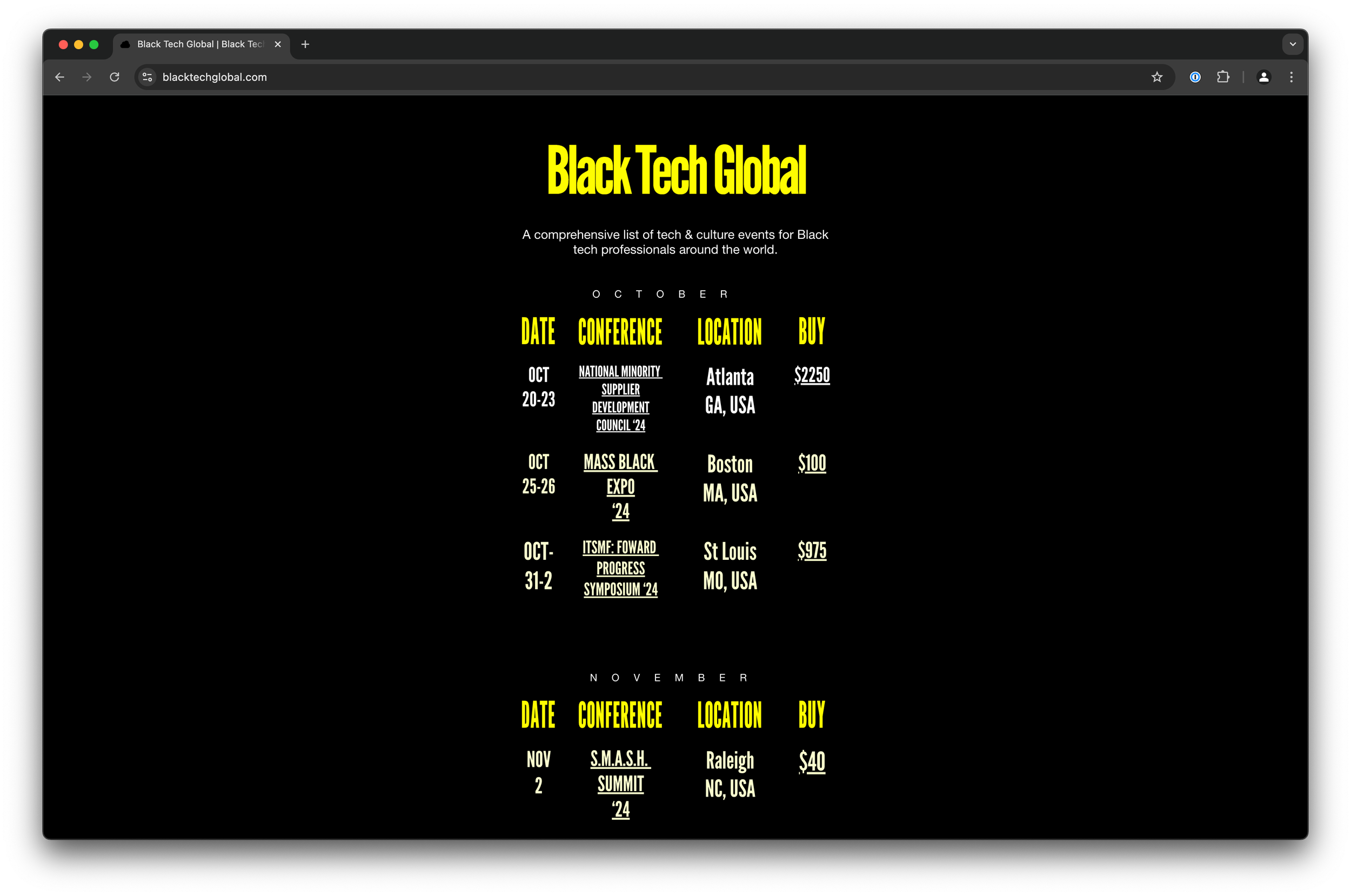
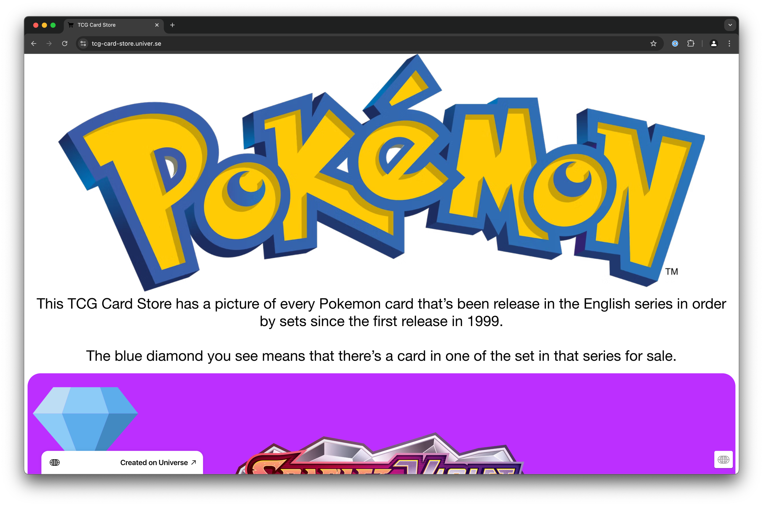
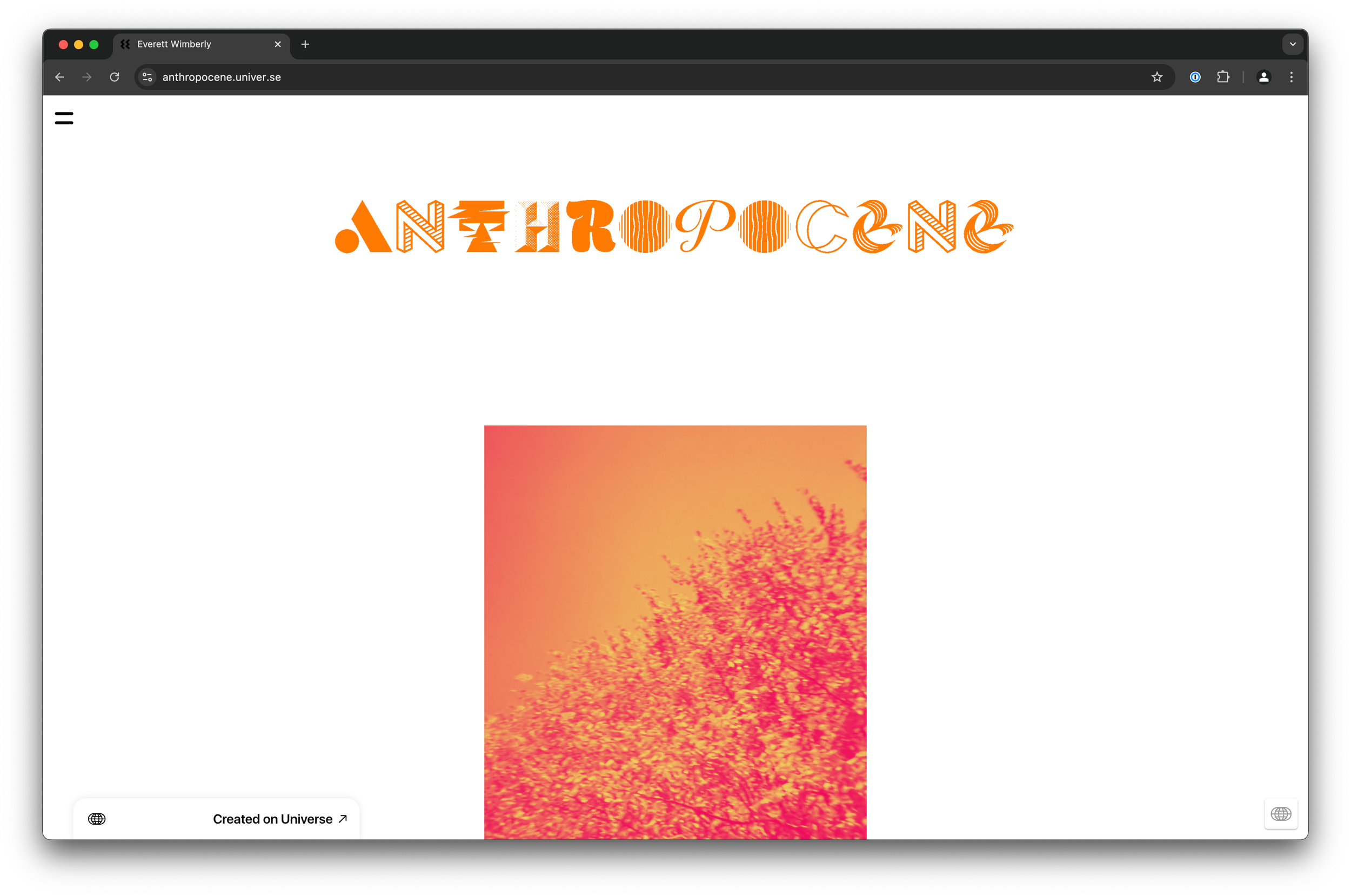
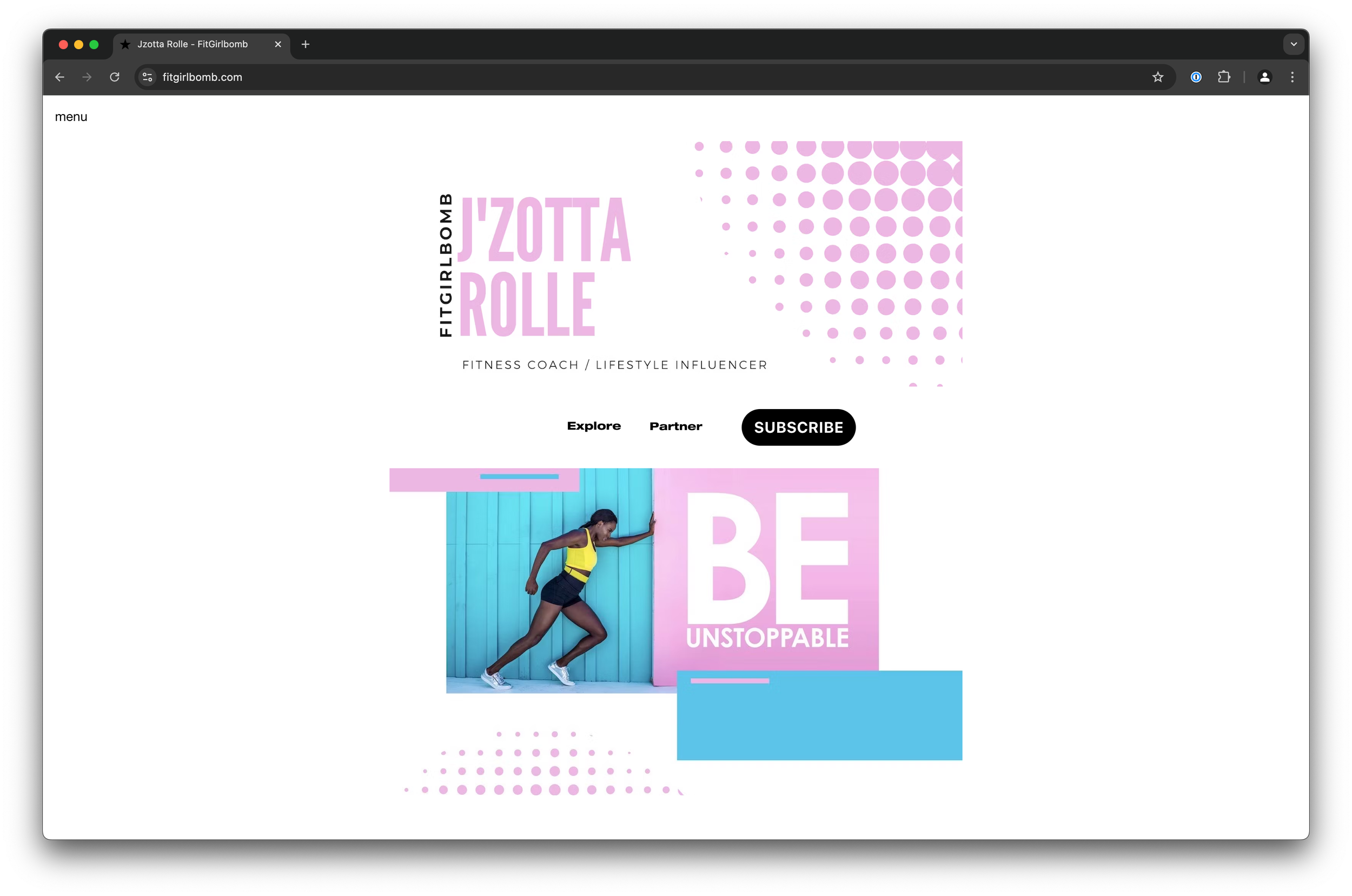
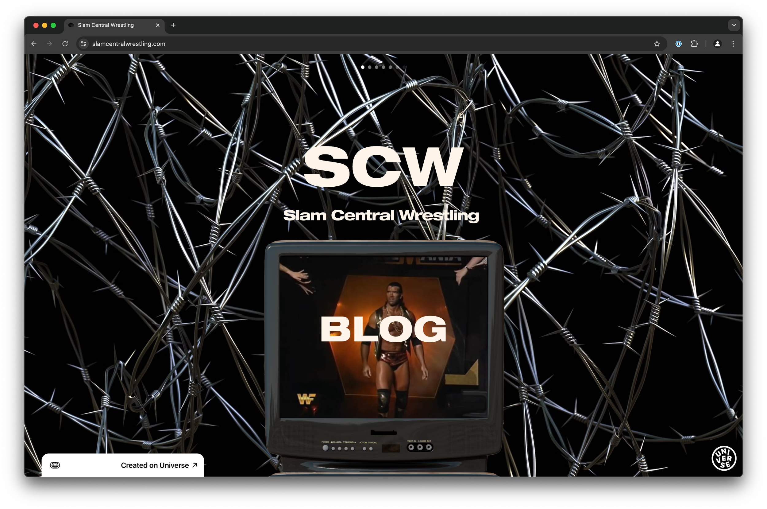
Sites made with Flex Grid
Follow Up Features
Stack Block
Allow content to automatically adjust how it flows across devices.
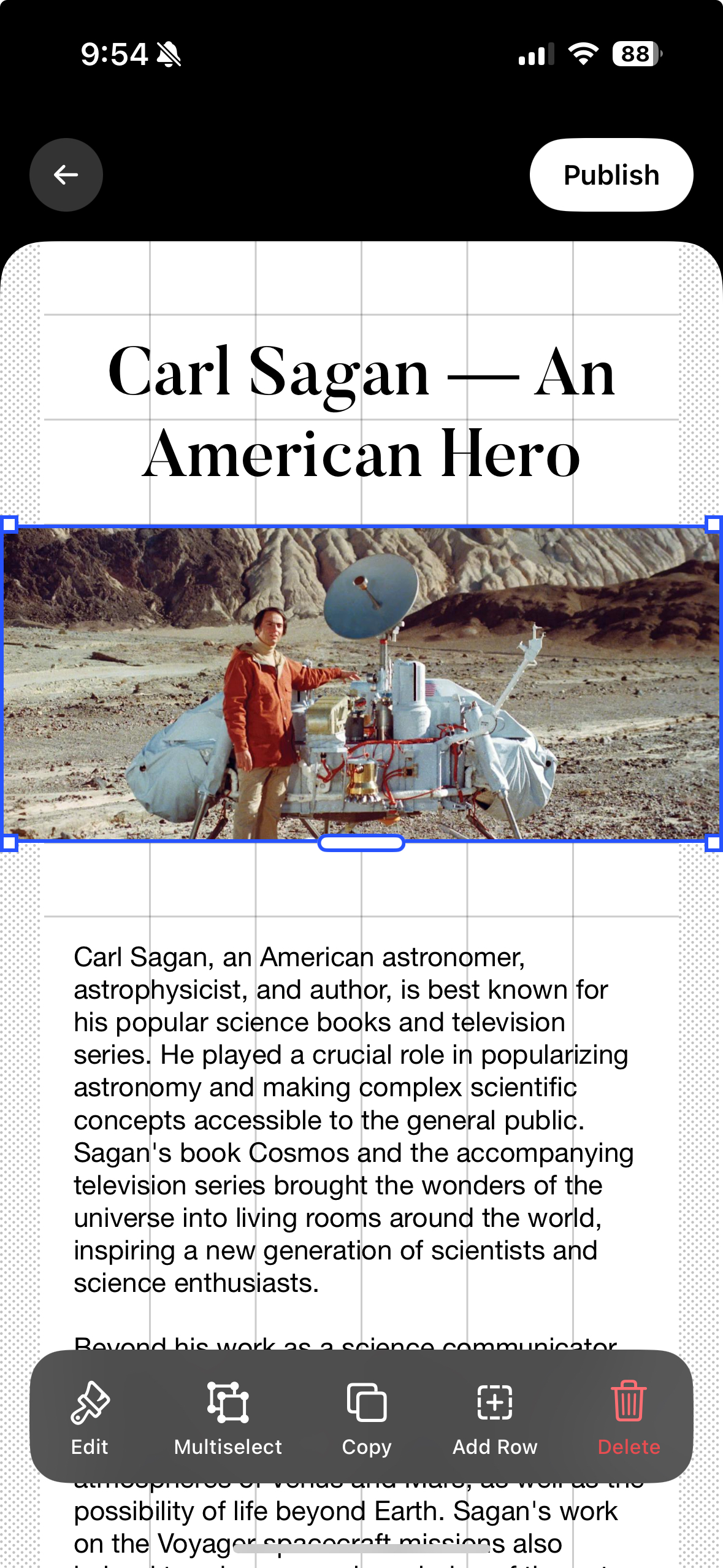
Multi-select
Give creators the ability to select multiple blocks and combine them into Stack or Group Blocks.
Final Designs
Launched in August 2024, the new editor unfortunately had little to no impact to the major business metrics like user acquisition, trial-to-sub, and retention. However, we did receive many positive reviews from existing users.
What I learned
- Good work takes time, especially with complex projects.
- Document EVERYTHING. This project had a lot of micro-decisions and I was always thankful we wrote out decisions and reasoning in organized Notion docs.
- Don’t be precious about an idea, new context will come up that changes how we’re thinking about a feature.